Bootstrap Modal Tutorial with Examples
1. Bootstrap Modal
No ADS
Modal is a Dialog or a Popup. It displays over all other contents of current page. The purpose of the Modal is to notify to users of something of applications or wait for users to enter information.
Although Javascript supports some different dialogs such as Confirm, Alert, Open File, Save file,..but obviously, these dialogs can not be customized, and so you expect something better.

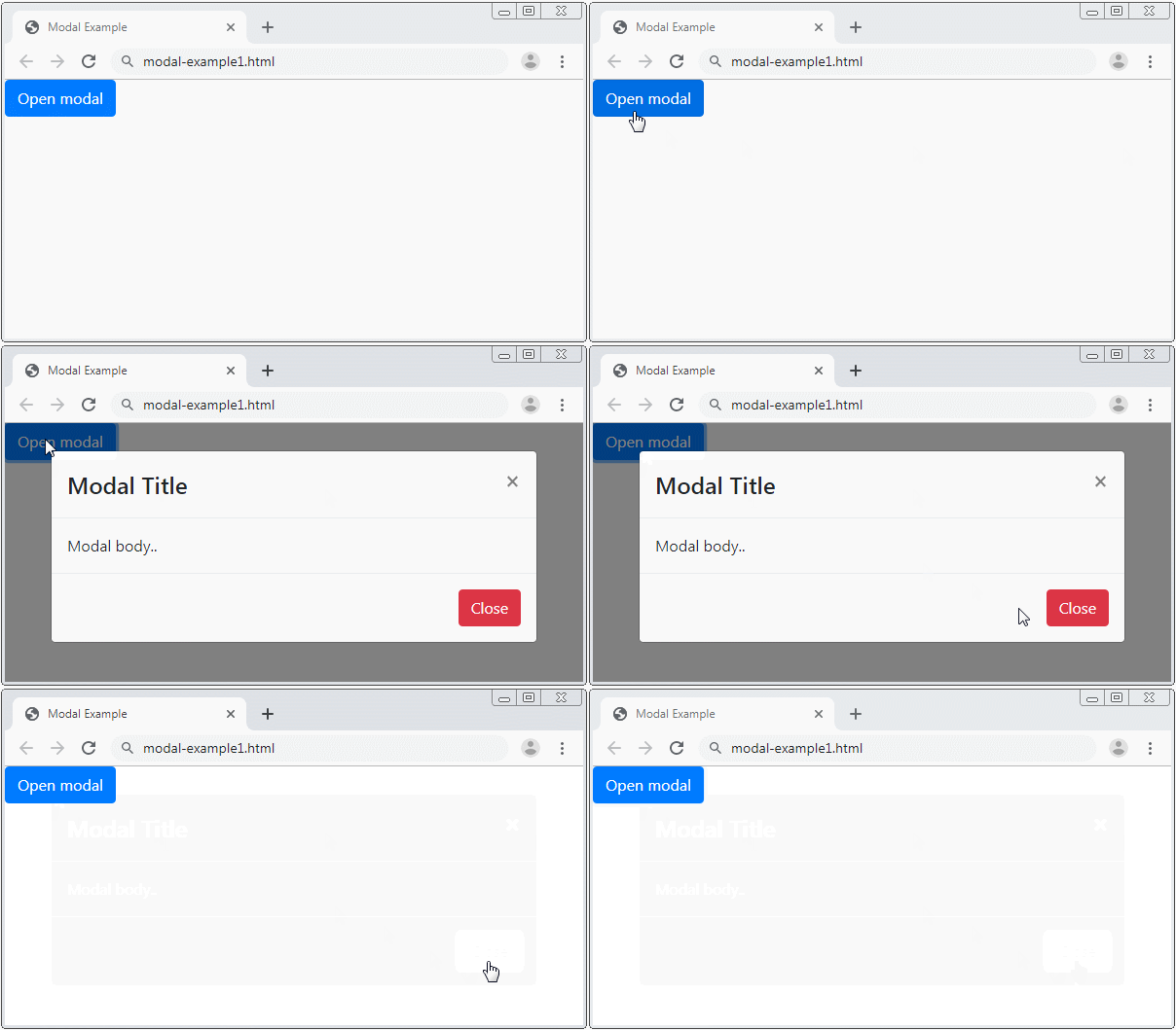
First, look at an example:

modal-example1.html
<!DOCTYPE html>
<html>
<head>
<meta charset="utf-8">
<title>Modal Example</title>
<link rel="stylesheet" href="https://maxcdn.bootstrapcdn.com/bootstrap/4.0.0/css/bootstrap.min.css">
</head>
<body>
<!-- Button to Open the Modal -->
<button type="button" class="btn btn-primary" data-toggle="modal" data-target="#myModal">
Open modal
</button>
<!-- The Modal -->
<div class="modal" id="myModal">
<div class="modal-dialog">
<div class="modal-content">
<!-- Modal Header -->
<div class="modal-header">
<h4 class="modal-title">Modal Heading</h4>
<button type="button" class="close" data-dismiss="modal">×</button>
</div>
<!-- Modal body -->
<div class="modal-body">
Modal body..
</div>
<!-- Modal footer -->
<div class="modal-footer">
<button type="button" class="btn btn-danger" data-dismiss="modal">Close</button>
</div>
</div>
</div>
</div>
<script src="https://code.jquery.com/jquery-3.2.1.slim.min.js"></script>
<script src="https://cdnjs.cloudflare.com/ajax/libs/popper.js/1.12.9/umd/popper.min.js"></script>
<script src="https://maxcdn.bootstrapcdn.com/bootstrap/4.0.0/js/bootstrap.min.js"></script>
</body>
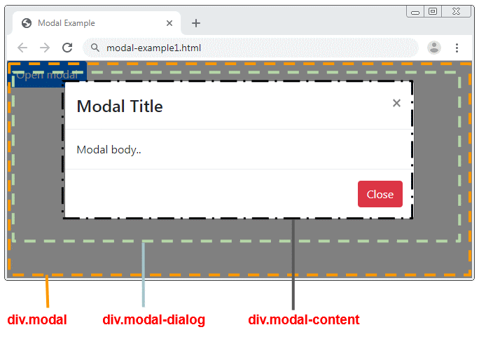
</html>Below is the structures of a modal. The div.modal-content element is the place where you are interested in. It consists of three zones: Header, Body & Footer, and you can customize it in all such three zones.

Modal Attributes
<div class="modal" id="myModal"
data-backdrop="static"
data-keyboard="false"
tabindex="-1"
aria-labelledby="myModalLabel"
aria-hidden="true">
<div class="modal-dialog">
<div class="modal-content">
<!-- Modal Header -->
<div class="modal-header">
<h4 class="modal-title">Modal Title</h4>
<button type="button" class="close" data-dismiss="modal">×</button>
</div>
<!-- Modal body -->
<div class="modal-body">
Modal body..
</div>
<!-- Modal footer -->
<div class="modal-footer">
<button type="button" class="btn btn-danger" data-dismiss="modal">Close</button>
</div>
</div>
</div>
</div>Attribute | Description |
data-backdrop | This attribute has two values such as true or static. By default, it is true, which means that the user can click on the background to close the Modal. |
data-keyboard | This attribute has two values such as true or false, defaulted as false. If it is true, the user can close the Modal by pressing ESC. |
aria-labelledby | The attribute of HTML5 |
aria-hidden | The attribute of HTML5 |
The .fade class allows you to create effects when the Modal hides or displays
.fade
<div class="modal fade" id="myModal">
<div class="modal-dialog">
<div class="modal-content">
<div class="modal-header">
<h4 class="modal-title">Modal Title</h4>
<button type="button" class="close" data-dismiss="modal">×</button>
</div>
<div class="modal-body">
Modal body..
</div>
<div class="modal-footer">
<button type="button" class="btn btn-danger" data-dismiss="modal">Close</button>
</div>
</div>
</div>
</div>
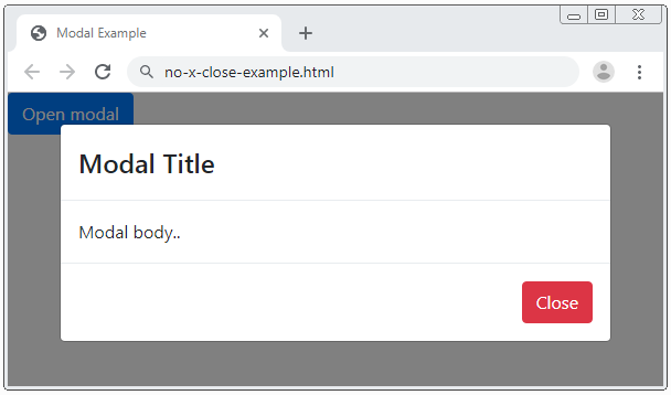
Example: create a Modal not containing "X" (Found at the top right corner of the Modal.)
Modal without X button
<div class="modal" id="myModal">
   <div class="modal-dialog">
      <div class="modal-content">
         <div class="modal-header">
            <h4 class="modal-title">Modal Title</h4>
         </div>
         <div class="modal-body">
            Modal body..
         </div>
         <div class="modal-footer">
            <button type="button" class="btn btn-danger" data-dismiss="modal">Close</button>
         </div>
      </div>
   </div>
</div>
2. Modal & jQuery
No ADS
You can use JQuery to interact with the Modal, for instance, hide or display the Modal.
$('#myModal').modal('toggle');
$('#myModal').modal('show');
$('#myModal').modal('hide');
Or fuller:
$('#myModal').modal(options);

// Example:

var options = {
  'backdrop' : 'static',
  'keyboard' : true,
  'show' : true,
  'focus' : false
}
Option | Description |
backdrop | This option has two values: true or static, defaulted as true, which means that the user can click on the background to close the Modal. |
keyboard | This option has two values: true or false, defaulted as false. If it is true, the user can close the Modal by pressing ESC. |
show | This option has two values: true or false, used to display or hide the Modal. |
focus | This option has two values: true or false, defaulted as false. If it is true, the Modal will be focused when it is created. |
3. Modal Events
Some events are fired when the Modal opens or closes. And you can catch these events to do something. Use the "on" method of the jQuery to bind the event with the handler.
Event | Description |
show.bs.modal | This event is fired immediately before the Modal displays. |
shown.bs.modal | This event is fired immediately after the Modal displays. |
hide.bs.modal | This event is fired immediately before the Modal is hidden |
hidden.bs.modal | This event is fired immediately after the Modal is hidden |
You can handle one of the above events like below:
$('#myModal').on('shown.bs.modal', function (e) {
  alert('Modal is successfully shown!');
});
No ADS
Bootstrap Tutorials
- Bootstrap Jumbotron Tutorial with Examples
- Bootstrap Dropdowns Tutorial with Examples
- Bootstrap Alerts Tutorial with Examples
- Bootstrap Buttons Tutorial with Examples
- Bootstrap Button Group Tutorial with Examples
- Bootstrap Popovers (Tooltips) Tutorial with Examples
- Bootstrap Spinners Tutorial with Examples
- Introduction to Bootstrap
- Bootstrap Grid System Tutorial with Examples
- Bootstrap Cards Tutorial with Examples
- Bootstrap Containers Tutorial with Examples
- Bootstrap Nav Tab/Pill Tutorial with Examples
- Bootstrap NavBars Tutorial with Examples
- Bootstrap Tables Tutorial with Examples
- Bootstrap Modal Tutorial with Examples
- Bootstrap Forms Tutorial with Examples
- Bootstrap Pagination Tutorial with Examples
- Bootstrap Badges Tutorial with Examples
- Bootstrap Input Group Tutorial with Examples
- Bootstrap List Groups Tutorial with Examples
- Bootstrap ProgressBars Tutorial with Examples
- Bootstrap Collapse and Accordion Tutorial with Examples
- Bootstrap Scrollspy Tutorial with Examples
- Bootstrap Breadcrumb Tutorial with Examples
- Bootstrap Carousel Tutorial with Examples
- Bootstrap Spacing Utilities Tutorial with Examples
- Bootstrap Border Utilities Tutorial with Examples
- Bootstrap Color Utilities Tutorial with Examples
- Bootstrap Text Utilities Tutorial with Examples
- Bootstrap Sizing Utilities Tutorial with Examples
- Bootstrap Position Utilities Tutorial with Examples
- Bootstrap Flex Utilities Tutorial with Examples
- Bootstrap Display Utilities Tutorial with Examples
- Bootstrap Visibility Utilities Tutorial with Examples
- Bootstrap Embed Utilities Tutorial with Examples
Show More