Bootstrap Tables Tutorial with Examples
1. Basic table
No ADS
Table is one of the components used widely in page. To obtain a table in the style of Bootstrap is quite simple. You need to apply only the .table class for <table> tags and a few additional classes to create a table as desired.
Apply the .table class to <table>, you will have the most basic table in the style of Bootstrap. The following illustration shows you difference between a default table and a table applying the .table class:
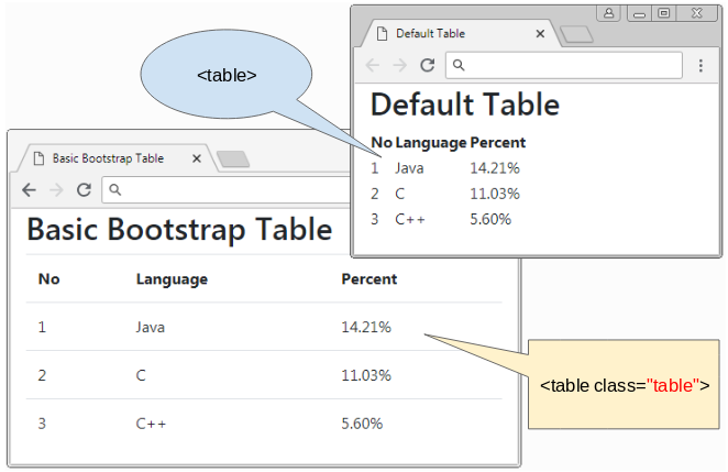
The .table class sets up width of 100% and transparent background color for table and padding for cells, ...
basic-table-example.html
<!DOCTYPE html>
<html>
   <head>
      <meta charset="utf-8">
      <title>Basic Bootstrap Table</title>
      <link rel="stylesheet" href="https://stackpath.bootstrapcdn.com/bootstrap/4.1.1/css/bootstrap.min.css">
   </head>
   <body>
      <div class="container">
         <h2>Basic Bootstrap Table</h2>
         <table class="table">
            <thead>
               <tr>
                  <th>No</th>
                  <th>Language</th>
                  <th>Percent</th>
               </tr>
            </thead>
            <tbody>
               <tr>
                  <td>1</td>
                  <td>Java</td>
                  <td>14.21%</td>
               </tr>
               <tr>
                  <td>2</td>
                  <td>C</td>
                  <td>11.03%</td>
               </tr>
               <tr>
                  <td>3</td>
                  <td>C++</td>
                  <td>5.60%</td>
               </tr>
            </tbody>
         </table>
      </div>
      <script src="https://code.jquery.com/jquery-3.3.1.slim.min.js"></script>
      <script src="https://cdnjs.cloudflare.com/ajax/libs/popper.js/1.14.3/umd/popper.min.js"></script>
      <script src="https://stackpath.bootstrapcdn.com/bootstrap/4.1.1/js/bootstrap.min.js"></script>
   </body>
</html>
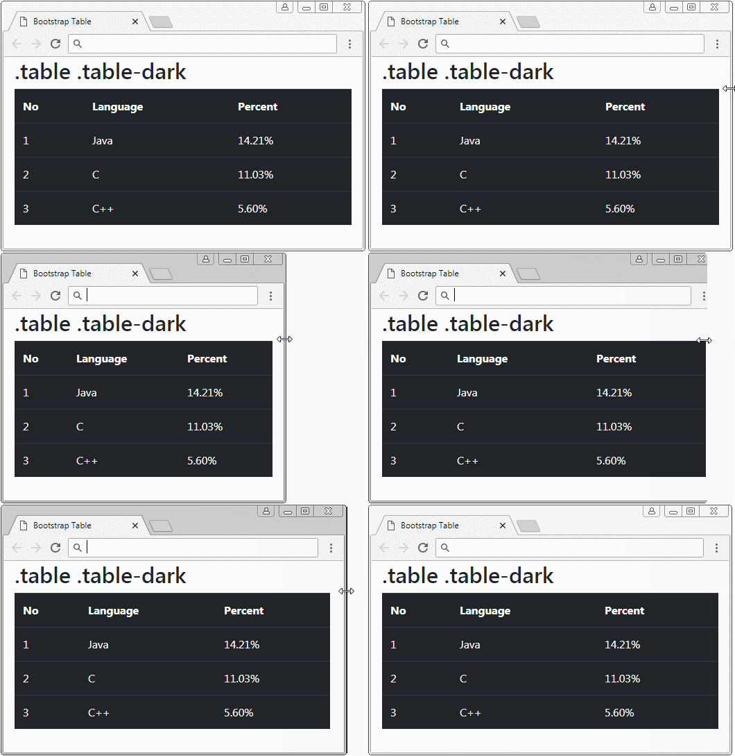
The .table class applies transparent background color to table, however, if you want to have other background color, you can use some following available classes:
- .table-primary
- .table-secondary
- .table-success
- .table-danger
- .table-warning
- .table-info
- .table-light
- .table-dark
- .table-muted
- .table-white
2. Header Color
You can set up background color for Header of table by using the .thead-dark class or .thead-light class for the <thead> tag:
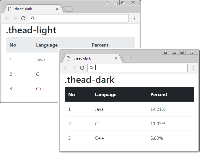
.thead-dark .thead-light
<table class="table">
   <thead class="thead-dark">
      <tr>
         <th>No</th>
         <th>Language</th>
         <th>Percent</th>
      </tr>
   </thead>
   <tbody>
      <tr>
         <td>1</td>
         <td>Java</td>
         <td>14.21%</td>
      </tr>
      <tr>
         <td>2</td>
         <td>C</td>
         <td>11.03%</td>
      </tr>
      <tr>
         <td>3</td>
         <td>C++</td>
         <td>5.60%</td>
      </tr>
   </tbody>
</table>
In addition, to set up the background color for table Header, you can also use the following classes:
- .table-primary
- .table-secondary
- .table-success
- .table-danger
- .table-warning
- .table-info
- .table-light
- .table-dark
- .table-muted
- .table-white
3. Cell Color
No ADS
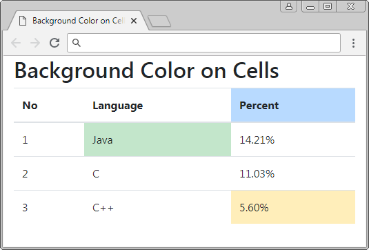
The following example shows you the way to establish background color for table cells:
- .table-primary
- .table-secondary
- .table-success
- .table-danger
- .table-warning
- .table-info
- .table-light
- .table-dark
- .table-muted
- .table-white
Background color on Cells
<table class="table">
   <thead>
      <tr>
         <th>No</th>
         <th>Language</th>
         <th class="table-primary">Percent</th>
      </tr>
   </thead>
   <tbody>
      <tr>
         <td>1</td>
         <td class="table-success">Java</td>
         <td>14.21%</td>
      </tr>
      <tr>
         <td>2</td>
         <td>C</td>
         <td>11.03%</td>
      </tr>
      <tr>
         <td>3</td>
         <td>C++</td>
         <td class="table-warning">5.60%</td>
      </tr>
   </tbody>
</table>
4. Striped Table
No ADS
Using the .table-striped class, you can create a striped table, which means that odd rows and even rows in <tbody> will have different background color. It helps users observe easily.
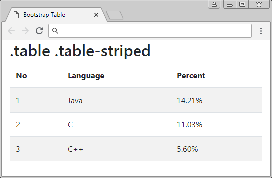
.table .table-striped
<table class="table table-striped">
   <thead>
      <tr>
         <th>No</th>
         <th>Language</th>
         <th>Percent</th>
      </tr>
   </thead>
   <tbody>
      <tr>
         <td>1</td>
         <td>Java</td>
         <td>14.21%</td>
      </tr>
      <tr>
         <td>2</td>
         <td>C</td>
         <td>11.03%</td>
      </tr>
      <tr>
         <td>3</td>
         <td>C++</td>
         <td>5.60%</td>
      </tr>
   </tbody>
</table>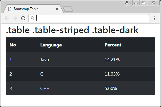
.table .table-striped .table-dark
<table class="table table-striped table-dark">
   <thead>
      <tr>
         <th>No</th>
         <th>Language</th>
         <th>Percent</th>
      </tr>
   </thead>
   <tbody>
      <tr>
         <td>1</td>
         <td>Java</td>
         <td>14.21%</td>
      </tr>
      <tr>
         <td>2</td>
         <td>C</td>
         <td>11.03%</td>
      </tr>
      <tr>
         <td>3</td>
         <td>C++</td>
         <td>5.60%</td>
      </tr>
   </tbody>
</table>
5. Bordered Table
The .table-bordered class will create border for 4 sides of table and all sides of all table cells.
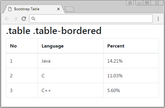
.table .table-bordered
<table class="table table-bordered">
   <thead>
      <tr>
         <th>No</th>
         <th>Language</th>
         <th>Percent</th>
      </tr>
   </thead>
   <tbody>
      <tr>
         <td>1</td>
         <td>Java</td>
         <td>14.21%</td>
      </tr>
      <tr>
         <td>2</td>
         <td>C</td>
         <td>11.03%</td>
      </tr>
      <tr>
         <td>3</td>
         <td>C++</td>
         <td>5.60%</td>
      </tr>
   </tbody>
</table>
.table .table-bordered .table-striped
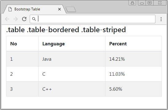
.table .table-bordered .table-striped
<table class="table table-bordered table-striped">
   <thead>
      <tr>
         <th>No</th>
         <th>Language</th>
         <th>Percent</th>
      </tr>
   </thead>
   <tbody>
      <tr>
         <td>1</td>
         <td>Java</td>
         <td>14.21%</td>
      </tr>
      <tr>
         <td>2</td>
         <td>C</td>
         <td>11.03%</td>
      </tr>
      <tr>
         <td>3</td>
         <td>C++</td>
         <td>5.60%</td>
      </tr>
   </tbody>
</table>
6. Borderless Table
No ADS
The .table-borderless class helps you to create a borderless table. All sides of table are borderless and so are all table cells.
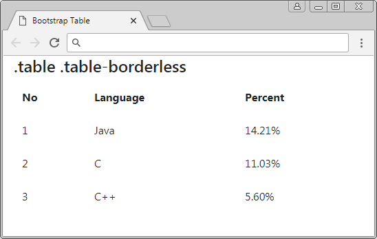
.table .table-borderless
<table class="table table-borderless">
   <thead>
      <tr>
         <th>No</th>
         <th>Language</th>
         <th>Percent</th>
      </tr>
   </thead>
   <tbody>
      <tr>
         <td>1</td>
         <td>Java</td>
         <td>14.21%</td>
      </tr>
      <tr>
         <td>2</td>
         <td>C</td>
         <td>11.03%</td>
      </tr>
      <tr>
         <td>3</td>
         <td>C++</td>
         <td>5.60%</td>
      </tr>
   </tbody>
</table>
Use .table-borderless + .table-dark to create a borderless table with dark background color.
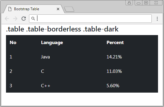
.table .table-borderless .table-dark
<table class="table table-borderless table-dark">
   <thead>
      <tr>
         <th>No</th>
         <th>Language</th>
         <th>Percent</th>
      </tr>
   </thead>
   <tbody>
      <tr>
         <td>1</td>
         <td>Java</td>
         <td>14.21%</td>
      </tr>
      <tr>
         <td>2</td>
         <td>C</td>
         <td>11.03%</td>
      </tr>
      <tr>
         <td>3</td>
         <td>C++</td>
         <td>5.60%</td>
      </tr>
   </tbody>
</table>
7. Hoverable rows
The .table-hover class helps you to create background color changing effect when the pointer moves over table row (only rows in <tbody>). This effect is the same as the illustration below:
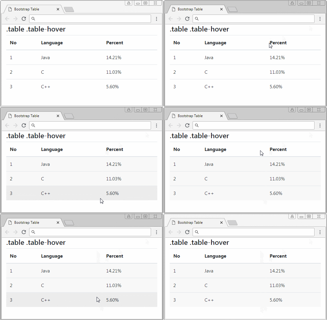
.table .table-hover
<table class="table table-hover">
   <thead>
      <tr>
         <th>No</th>
         <th>Language</th>
         <th>Percent</th>
      </tr>
   </thead>
   <tbody>
      <tr>
         <td>1</td>
         <td>Java</td>
         <td>14.21%</td>
      </tr>
      <tr>
         <td>2</td>
         <td>C</td>
         <td>11.03%</td>
      </tr>
      <tr>
         <td>3</td>
         <td>C++</td>
         <td>5.60%</td>
      </tr>
   </tbody>
</table>
8. Table .table-sm
The Bootstrap sets up padding for table cells. By default, this value is 0.75rem. If you need a more compact table, please use the .table-sm class. This class reduces the value of the padding by a half. Below is the illustration of a table not using the .table-sm class and another table using .table-sm.
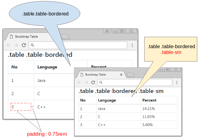
.table-sm
<table class="table table-bordered table-sm">
   <thead>
      <tr>
         <th>No</th>
         <th>Language</th>
         <th>Percent</th>
      </tr>
   </thead>
   <tbody>
      <tr>
         <td>1</td>
         <td>Java</td>
         <td>14.21%</td>
      </tr>
      <tr>
         <td>2</td>
         <td>C</td>
         <td>11.03%</td>
      </tr>
      <tr>
         <td>3</td>
         <td>C++</td>
         <td>5.60%</td>
      </tr>
   </tbody>
</table>
9. Responsive Table
It is difficult for you to create a table suitable for the devices with different screen width. When the width of device is smaller and smaller, the table columns will try to reduce their width. In fact, the columns can not reduce their width to 0. And when the table can not reduce its width more, scroll bar located horizontally on the browser will appear.
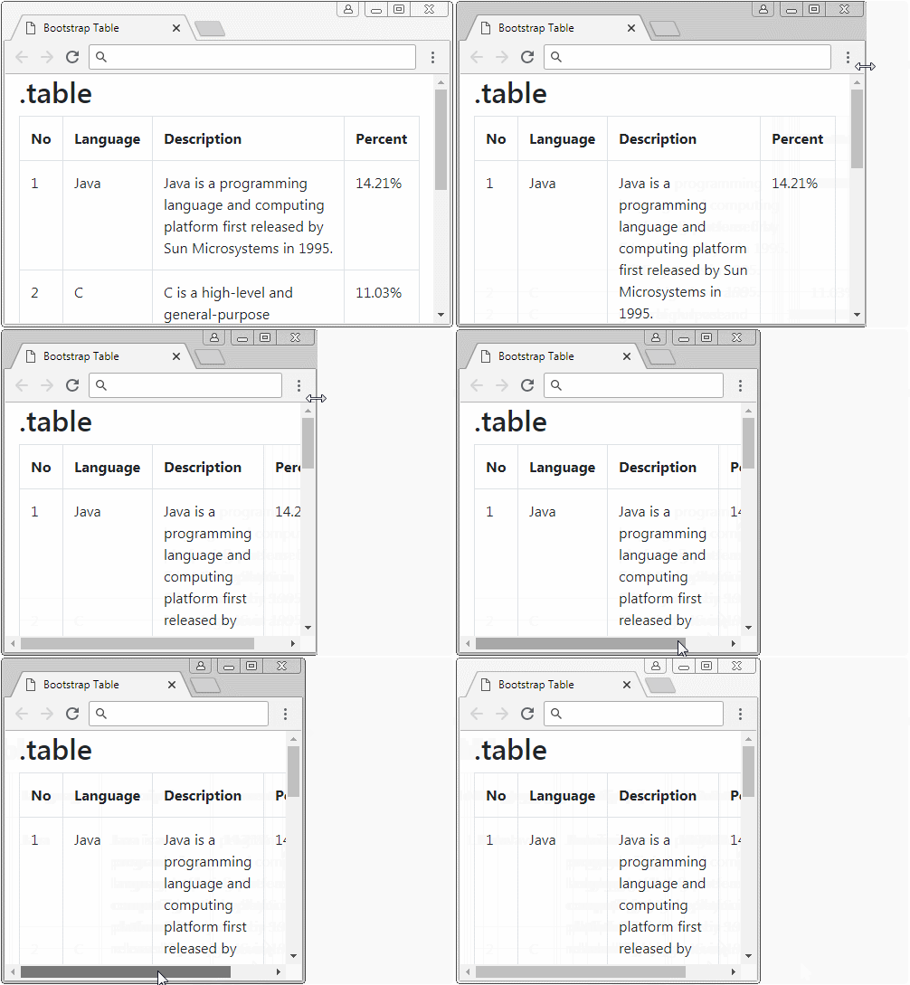
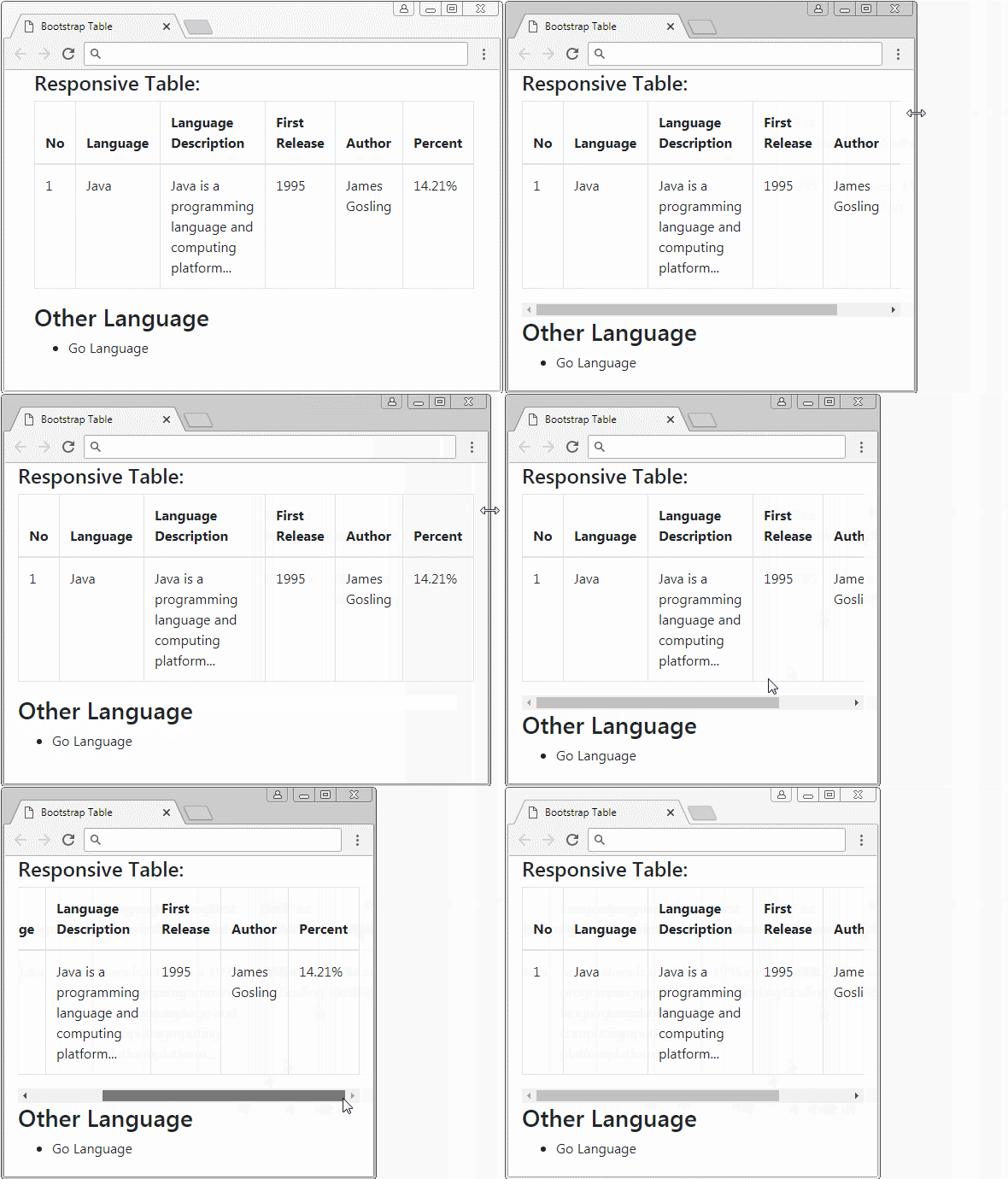
The solution of Bootstrap is using a <div class="table-responsive[-sm|-md|-lg|-xl]"> tag to wrap a table. the horizontal scroll bar will appear on the <div> tag if the table can not reduce its width more. Thus, the horizontal scroll bar will appear on the <div> tag instead of appearing on the browser.
Css Class | Description |
.table-responsive | If the table can not itself reduce its width more, the horizontal scroll bar will appear. |
.table-responsive-sm | If the width of device (or browser) is smaller than 567px and the table can not itself reduce its width more, the horizontal scroll bar will appear. |
.table-responsive-md | If the width of device (or browser) is smaller than 768px and the table can not itself reduce its width more, the horizontal scroll bar will appear. |
.table-responsive-lg | If the width of device (or browser) is smaller than 992px and the table can not itself reduce its width more, the horizontal scroll bar will appear. |
.table-responsive-xl | If the width of device (or browser) is smaller than 1200px and the table can not itself reduce its width more, the horizontal scroll bar will appear. |
responsive-table-example.html
<!DOCTYPE html>
<html>
   <head>
      <meta charset="utf-8">
      <title>Bootstrap Table</title>
      <link rel="stylesheet" href="https://stackpath.bootstrapcdn.com/bootstrap/4.1.1/css/bootstrap.min.css">
   </head>
   <body>
      <div class="container-fluid">
         <h4>Responsive Table:</h4>
         <div class="table-responsive-sm">
            <table class="table table-bordered">
               <thead>
                  <tr>
                     <th>No</th>
                     <th>Language</th>
                     <th>Language Description</th>

                     <th>First Release</th>
                     <th>Author</th>
                     <th>Percent</th>
                  </tr>
               </thead>
               <tbody>
                  <tr>
                     <td>1</td>
                     <td>Java</td>
                     <td>Java is a programming language and computing platform...
                     </td>
                     <td>1995</td>
                     <td>James Gosling</td>
                     <td>14.21%</td>
                  </tr>
               </tbody>
            </table>

         </div>
         <h3>Other Language</h3>
         <ul>
            <li>Go Language</li>
         </ul>
      </div>
      <script src="https://code.jquery.com/jquery-3.3.1.slim.min.js"></script>
      <script src="https://cdnjs.cloudflare.com/ajax/libs/popper.js/1.14.3/umd/popper.min.js"></script>
      <script src="https://stackpath.bootstrapcdn.com/bootstrap/4.1.1/js/bootstrap.min.js"></script>
   </body>
</html>
10. Column size
No ADS
For Google, I have found some solutions to set up the width for the columns of a table in Bootstrap. However, after checking, I finds that a solution works well with Firefox but it doesn't work with Chrome. Below, I give some examples and solutions that I think they are the best:
Example 1:
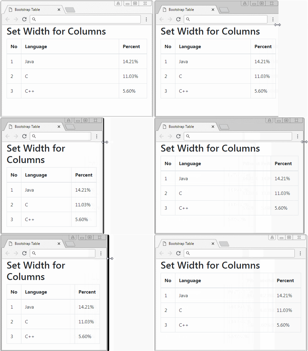
A table has 3 columns. The first column has width of 10%. The second column has width of 70%. The third column has width of 20%.
- Solution: Please use style ="width: X%".
style="width: X%"
<table class="table table-bordered">
   <thead>
      <tr>
         <th style="width: 10%">No</th>
         <th style="width: 70%">Language</th>
         <th style="width: 20%">Percent</th>
      </tr>
   </thead>
   <tbody>
      <tr>
         <td>1</td>
         <td>Java</td>
         <td>14.21%</td>
      </tr>
      <tr>
         <td>2</td>
         <td>C</td>
         <td>11.03%</td>
      </tr>
      <tr>
         <td>3</td>
         <td>C++</td>
         <td>5.60%</td>
      </tr>
   </tbody>
</table>
Example 2:
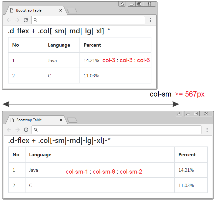
You have a table with 3 columns and you want:
For the equipment with the width of >= 567px | 3 columns will have width rate of 1:9:2 |
For the equipment with the width of < 567px | 3 columns will have width rate of 3:3:6 |
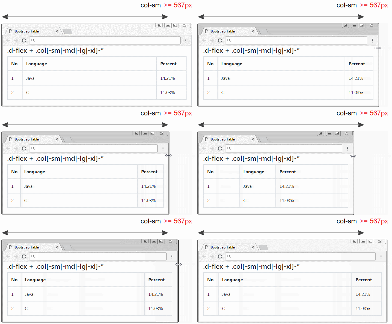
.d-flex + .col[-sm|-md|-lg|-xl]-*
<table class="table table-bordered">
   <thead>
      <tr class="d-flex">
         <th class="col-3 col-sm-1">No</th>
         <th class="col-3 col-sm-9">Language</th>
         <th class="col-6 col-sm-2">Percent</th>
      </tr>
   </thead>
   <tbody>
      <tr class="d-flex">
         <td class="col-3 col-sm-1">1</td>
         <td class="col-3 col-sm-9">Java</td>
         <td class="col-6 col-sm-2">14.21%</td>
      </tr>
      <tr class="d-flex">
         <td class="col-3 col-sm-1">2</td>
         <td class="col-3 col-sm-9">C</td>
         <td class="col-6 col-sm-2">11.03%</td>
      </tr>
   </tbody>
</table>
No ADS
Bootstrap Tutorials
- Bootstrap Jumbotron Tutorial with Examples
- Bootstrap Dropdowns Tutorial with Examples
- Bootstrap Alerts Tutorial with Examples
- Bootstrap Buttons Tutorial with Examples
- Bootstrap Button Group Tutorial with Examples
- Bootstrap Popovers (Tooltips) Tutorial with Examples
- Bootstrap Spinners Tutorial with Examples
- Introduction to Bootstrap
- Bootstrap Grid System Tutorial with Examples
- Bootstrap Cards Tutorial with Examples
- Bootstrap Containers Tutorial with Examples
- Bootstrap Nav Tab/Pill Tutorial with Examples
- Bootstrap NavBars Tutorial with Examples
- Bootstrap Tables Tutorial with Examples
- Bootstrap Modal Tutorial with Examples
- Bootstrap Forms Tutorial with Examples
- Bootstrap Pagination Tutorial with Examples
- Bootstrap Badges Tutorial with Examples
- Bootstrap Input Group Tutorial with Examples
- Bootstrap List Groups Tutorial with Examples
- Bootstrap ProgressBars Tutorial with Examples
- Bootstrap Collapse and Accordion Tutorial with Examples
- Bootstrap Scrollspy Tutorial with Examples
- Bootstrap Breadcrumb Tutorial with Examples
- Bootstrap Carousel Tutorial with Examples
- Bootstrap Spacing Utilities Tutorial with Examples
- Bootstrap Border Utilities Tutorial with Examples
- Bootstrap Color Utilities Tutorial with Examples
- Bootstrap Text Utilities Tutorial with Examples
- Bootstrap Sizing Utilities Tutorial with Examples
- Bootstrap Position Utilities Tutorial with Examples
- Bootstrap Flex Utilities Tutorial with Examples
- Bootstrap Display Utilities Tutorial with Examples
- Bootstrap Visibility Utilities Tutorial with Examples
- Bootstrap Embed Utilities Tutorial with Examples
Show More