Bootstrap Alerts Tutorial with Examples
1. Bootstrap Alert
No ADS
Alert is a built-in interface component of Bootstrap. It is a page space that displays a message. Such message can be an information or an error warning, ... (info, warning, danger,..).
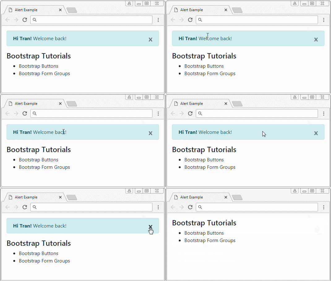
Different from the Model component, Alert is not displayed such as a window. It is zone on a page but there can be "x" to help you to be able to close this space zone.
Different from the Model component, Alert is not displayed such as a window. It is zone on a page but there can be "x" to help you to be able to close this space zone.

alert-example.html
<!DOCTYPE html>
<html>
   <head>
      <meta charset="utf-8">
      <title>Alert Example</title>
      <link rel="stylesheet" href="https://maxcdn.bootstrapcdn.com/bootstrap/4.0.0/css/bootstrap.min.css">
   </head>
   <body>
      <div class="container mt-3">

         <div class="alert alert-info">
            <strong>Hi Tran!</strong> Welcome back!
            <button type="button" class="close" data-dismiss="alert" aria-label="Close">x</button>
         </div>


         <h4>Bootstrap Tutorials</h4>
         <ul>
            <li>Bootstrap Buttons</li>
            <li>Bootstrap Form Groups</li>
         </ul>
      </div>

      <script src="https://code.jquery.com/jquery-3.2.1.slim.min.js"></script>
      <script src="https://cdnjs.cloudflare.com/ajax/libs/popper.js/1.12.9/umd/popper.min.js"></script>
      <script src="https://maxcdn.bootstrapcdn.com/bootstrap/4.0.0/js/bootstrap.min.js"></script>

   </body>
</html>
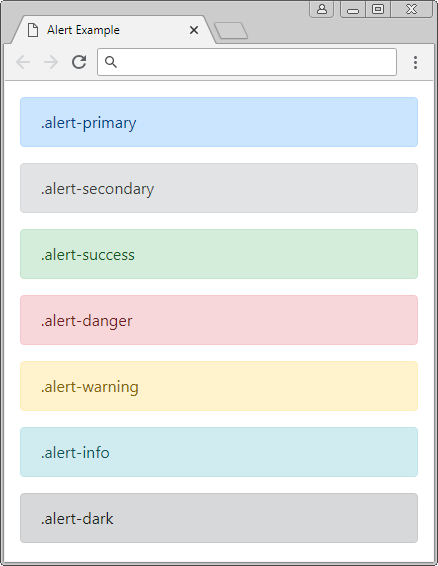
Use the .alert class in combination with one of .alert-info, .alert-warning, .alert-danger classes, .. to create an Alert suitable for your context.
<div class="alert alert-primary">.alert-primary</div>
<div class="alert alert-secondary">.alert-secondary</div>
<div class="alert alert-success">.alert-success</div>
<div class="alert alert-danger">.alert-danger</div>
<div class="alert alert-warning">.alert-warning</div>
<div class="alert alert-info">.alert-info</div>
<div class="alert alert-dark">.alert-dark</div>
.alert-link
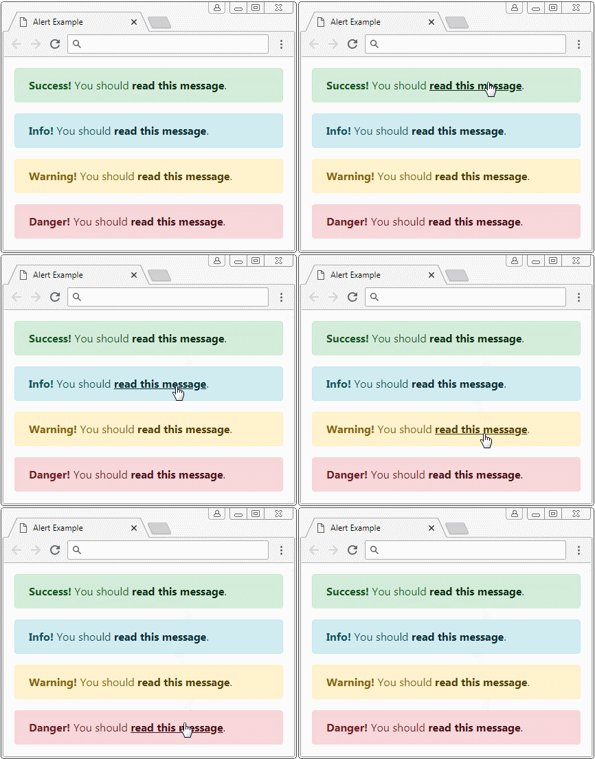
Probably, inside an Alert, you use <a> tags, you should use the .alert-link class for this tag. The .alert-link class will set up color for the <a> tag to match with the context of the Alert.

.alert-link
<div class="alert alert-success">
   <strong>Success!</strong> You should <a href="#" class="alert-link">read this message</a>.
</div>
<div class="alert alert-info">
   <strong>Info!</strong> You should <a href="#" class="alert-link">read this message</a>.
</div>
<div class="alert alert-warning">
   <strong>Warning!</strong> You should <a href="#" class="alert-link">read this message</a>.
</div>
<div class="alert alert-danger">
   <strong>Danger!</strong> You should <a href="#" class="alert-link">read this message</a>.
</div>
2. Alert with close button
No ADS
To create a closable Alert, you need to use the .alert-dismissible class for the Alert, and add attributes: class="close" data-dismiss="alert" for closing button. The closing button will display on the top right corner of the Alert, when the user presses this button, the Alert will be hidden.

closing-alert-example.html
<!DOCTYPE html>
<html>
<head>
<meta charset="utf-8">
<title>Alert Example</title>
<link rel="stylesheet" href="https://maxcdn.bootstrapcdn.com/bootstrap/4.0.0/css/bootstrap.min.css">
</head>
<body>
<div class="container mt-3">
<div class="alert alert-info alert-dismissible">
<strong>Hi Tran!</strong> Welcome back!
<button type="button" class="close" data-dismiss="alert" aria-label="Close">×</button>
</div>
<h4>Bootstrap Tutorials</h4>
<ul>
<li>Bootstrap Buttons</li>
<li>Bootstrap Form Groups</li>
</ul>
</div>
<script src="https://code.jquery.com/jquery-3.2.1.slim.min.js"></script>
<script src="https://cdnjs.cloudflare.com/ajax/libs/popper.js/1.12.9/umd/popper.min.js"></script>
<script src="https://maxcdn.bootstrapcdn.com/bootstrap/4.0.0/js/bootstrap.min.js"></script>
</body>Class/Attribute | Description |
.alert-dismissible | You may not need this class because it does not affect whether Alert can close or not. But it helps set up padding for .close. |
data-dismiss="alert" | This attribute should be added to the (x) close button. Bootstrap automatically registers handler for event. The user presses this button. When the user presses the (x) close button, the Alert will be hidden. |
3. Customize Alert
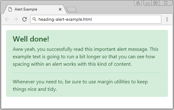
You can create a customized Alert, with complex HTML content. Let's remember that the Bootstrap provides you with a .alert-heading class to apply to "heading" of the Alert.
.alert-heading
<div class="alert alert-success" role="alert">
   <h4 class="alert-heading">Well done!</h4>
   <p>Aww yeah, you successfully read this important alert message.
      This example text is going to run a bit longer
       so that you can see how spacing within an alert works with this kind of content.
   </p>
   <hr>
   <p class="mb-0">Whenever you need to,
       be sure to use margin utilities to keep things nice and tidy.</p>
</div>
No ADS
Bootstrap Tutorials
- Bootstrap Jumbotron Tutorial with Examples
- Bootstrap Dropdowns Tutorial with Examples
- Bootstrap Alerts Tutorial with Examples
- Bootstrap Buttons Tutorial with Examples
- Bootstrap Button Group Tutorial with Examples
- Bootstrap Popovers (Tooltips) Tutorial with Examples
- Bootstrap Spinners Tutorial with Examples
- Introduction to Bootstrap
- Bootstrap Grid System Tutorial with Examples
- Bootstrap Cards Tutorial with Examples
- Bootstrap Containers Tutorial with Examples
- Bootstrap Nav Tab/Pill Tutorial with Examples
- Bootstrap NavBars Tutorial with Examples
- Bootstrap Tables Tutorial with Examples
- Bootstrap Modal Tutorial with Examples
- Bootstrap Forms Tutorial with Examples
- Bootstrap Pagination Tutorial with Examples
- Bootstrap Badges Tutorial with Examples
- Bootstrap Input Group Tutorial with Examples
- Bootstrap List Groups Tutorial with Examples
- Bootstrap ProgressBars Tutorial with Examples
- Bootstrap Collapse and Accordion Tutorial with Examples
- Bootstrap Scrollspy Tutorial with Examples
- Bootstrap Breadcrumb Tutorial with Examples
- Bootstrap Carousel Tutorial with Examples
- Bootstrap Spacing Utilities Tutorial with Examples
- Bootstrap Border Utilities Tutorial with Examples
- Bootstrap Color Utilities Tutorial with Examples
- Bootstrap Text Utilities Tutorial with Examples
- Bootstrap Sizing Utilities Tutorial with Examples
- Bootstrap Position Utilities Tutorial with Examples
- Bootstrap Flex Utilities Tutorial with Examples
- Bootstrap Display Utilities Tutorial with Examples
- Bootstrap Visibility Utilities Tutorial with Examples
- Bootstrap Embed Utilities Tutorial with Examples
Show More