Bootstrap Dropdowns Tutorial with Examples
1. Bootstrap Dropdown
No ADS
Dropdown is basically a component including a button and a menu. When an user presses the Button, Menu will appear to allow the user to select a value from an available list. Below is the picture of a few Dropdowns:
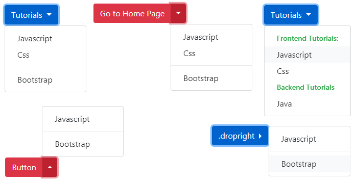
Dropdown
<div class="btn-group">
   <button class="btn btn-primary dropdown-toggle"
      type="button"
      id="dropdownMenuButton" data-toggle="dropdown">
   Tutorials
   </button>
   <div class="dropdown-menu">
      <a class="dropdown-item" href="#">Javascript</a>
      <a class="dropdown-item" href="#">Css</a>
      <div class="dropdown-divider"></div>
      <a class="dropdown-item" href="#">Bootstrap</a>
   </div>
</div>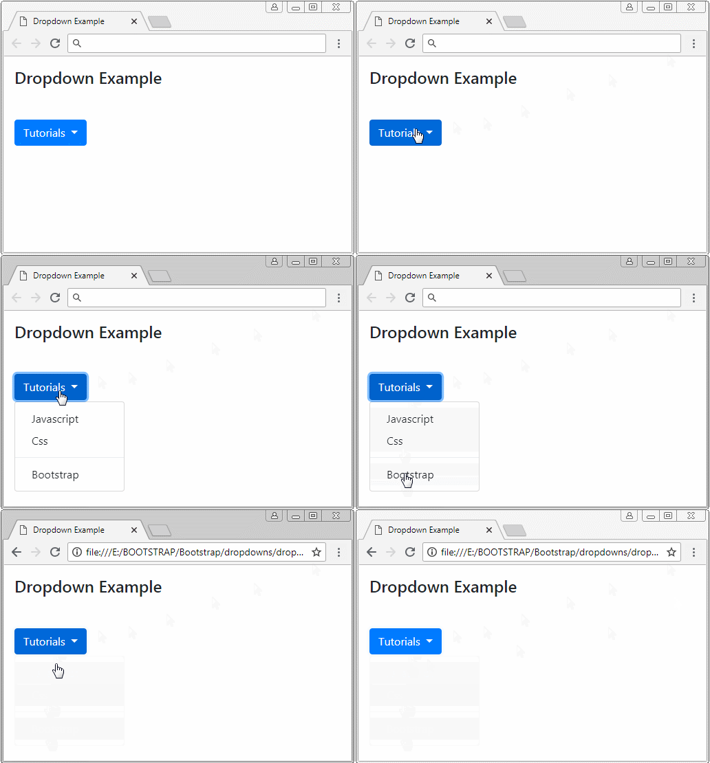
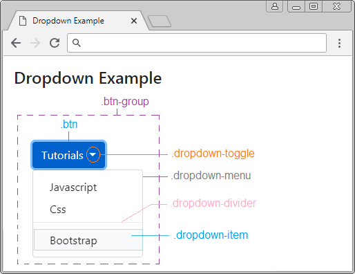
The structure of the Dropdown is described simply like the following illustration:
Xem ví dụ đầy đủ:
dropdown-example.html
<!DOCTYPE html>
<html>
   <head>
      <meta charset="utf-8">
      <title>Dropdown Example</title>
      <link rel="stylesheet" href="https://stackpath.bootstrapcdn.com/bootstrap/4.1.1/css/bootstrap.min.css">
   </head>
   <body>
      <div class="container mt-3">

         <h4 class="mb-5">Dropdown Example</h4>


         <div class="btn-group">
            <button class="btn btn-primary dropdown-toggle"
               type="button"
               id="dropdownMenuButton" data-toggle="dropdown">
             Tutorials
            </button>
            <div class="dropdown-menu">
               <a class="dropdown-item" href="#">Javascript</a>
               <a class="dropdown-item" href="#">Css</a>
               <div class="dropdown-divider"></div>
               <a class="dropdown-item" href="#">Bootstrap</a>
            </div>
         </div>

      </div>

      <script src="https://code.jquery.com/jquery-3.3.1.slim.min.js"></script>
      <script src="https://cdnjs.cloudflare.com/ajax/libs/popper.js/1.14.3/umd/popper.min.js"></script>
      <script src="https://stackpath.bootstrapcdn.com/bootstrap/4.1.1/js/bootstrap.min.js"></script>
   </body>
</html>
The aria-* (aria-haspopup, aria-expanded,..) attributes are ones of HTML5. You don't probably need to be interested in them. And it doesn't affect the components of the Bootstrap. They are usually used as a hint for the equipment such as Screen Reader (Screen reading device for the blind).aria-* ???<div class="btn-group"> <button class="btn btn-primary dropdown-toggle" type="button" id="dropdownMenuButton" data-toggle="dropdown" aria-haspopup="true" aria-expanded="false"> Tutorial </button> <div class="dropdown-menu"> <a class="dropdown-item" href="#">Javascript</a> <a class="dropdown-item" href="#">Css</a> <div class="dropdown-divider"></div> <a class="dropdown-item" href="#">Bootstrap</a> </div> </div>
2. Split Button Dropdown
Split Button Dropdown that is seen on interface by you, is the same as a Button separated into 2 parts, on the left and on the right. The left works as a normal button while the right works as a Menu. In fact, it is 2 buttons located closely, and in the same ".btn-group". Below is the structure of Split Button Dropdown:
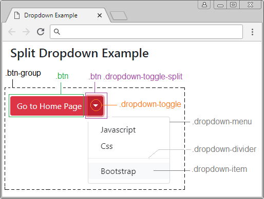
Split Button Dropdown
<div class="btn-group">

   <button type="button" class="btn btn-danger">Go to Home Page</button>

   <button type="button" class="btn btn-danger dropdown-toggle dropdown-toggle-split"
      data-toggle="dropdown"
      aria-haspopup="true" aria-expanded="false">

   <span class="sr-only">Toggle Dropdown</span>

   </button>

   <div class="dropdown-menu">
      <a class="dropdown-item" href="#">Javascript</a>
      <a class="dropdown-item" href="#">Css</a>
      <div class="dropdown-divider"></div>
      <a class="dropdown-item" href="#">Bootstrap</a>
   </div>

</div>
Note: The .sr-only Class (Screen Reader Only) is a hidden one. It only makes sense for screen readers (a device for the blind).
3. .dropdown, .dropup, dropright, .dropleft
No ADS
By default, Menu will display downwards, however, you can also set up other act for it, such as displaying left, right, or up. These acts are similar to the following illustration:
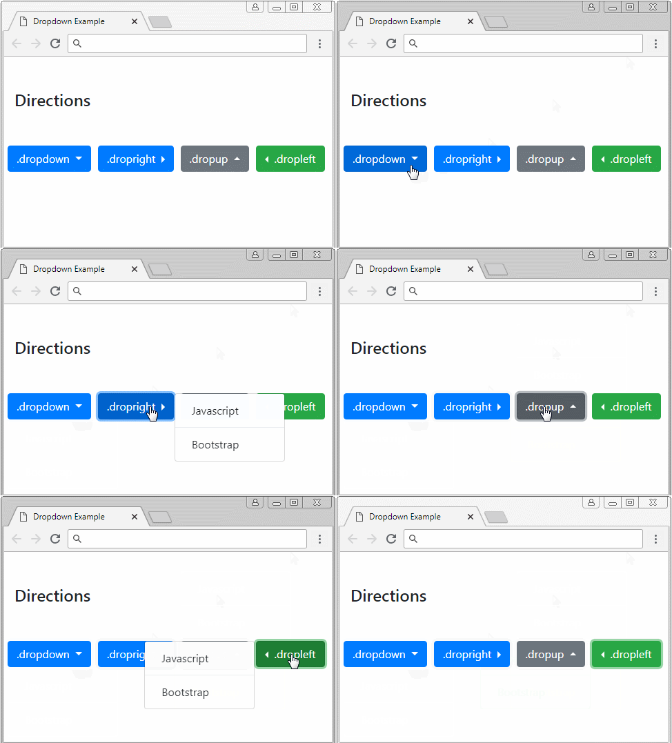
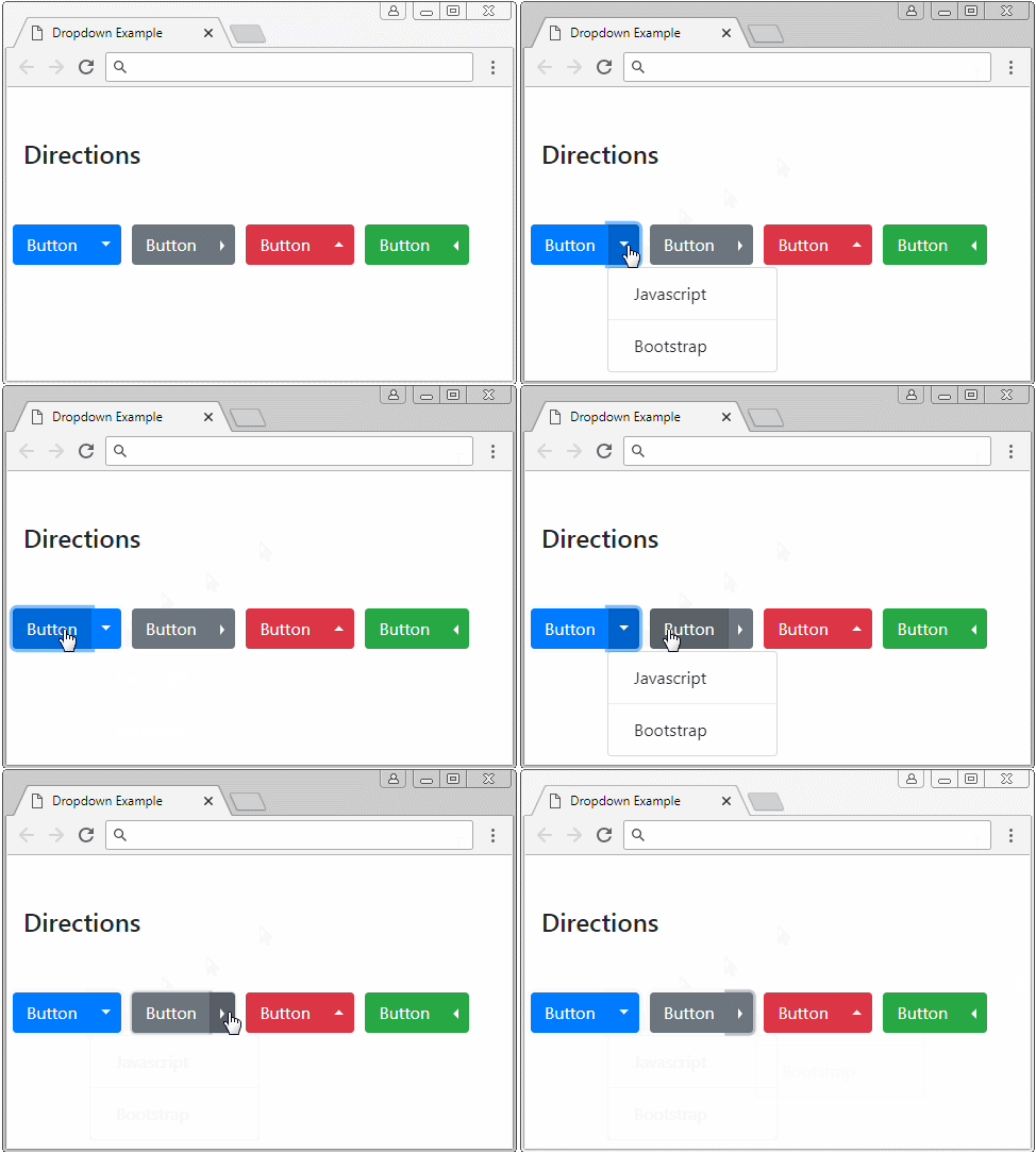
It is noted, although you establish the direction for Menu to display, that is only a hint. It is not ensured in every situation, for example, you set up so that Menu displays on the right but the space on the right is not enough, it will display on the left.
.dropdown .dropright .dropup .dropleft
<!-- .dropright -->
<div class="btn-group dropright">
   <button class="btn btn-primary dropdown-toggle"
      type="button"
      id="dropdownMenuButton" data-toggle="dropdown"
      aria-haspopup="true" aria-expanded="false">
   .dropright
   </button>
   <div class="dropdown-menu">
      <a class="dropdown-item" href="#">Javascript</a>
      <div class="dropdown-divider"></div>
      <a class="dropdown-item" href="#">Bootstrap</a>
   </div>
</div>

<!-- Split .dropup -->
<div class="btn-group dropup">
   <button type="button" class="btn btn-danger">Button</button>
   <button type="button" class="btn btn-danger dropdown-toggle dropdown-toggle-split"
      data-toggle="dropdown"
      aria-haspopup="true" aria-expanded="false">
   <span class="sr-only">Toggle Dropdown</span>
   </button>
   <div class="dropdown-menu">
      <a class="dropdown-item" href="#">Javascript</a>
      <div class="dropdown-divider"></div>
      <a class="dropdown-item" href="#">Bootstrap</a>
   </div>
</div>
4. Button Size
No ADS
By default, the buttons have .btn-md "Medium" size. However, you can set it to another size using the .btn-lg (Large) class to have a larger size button, or use the .btn-sm (Small) class to have a smaller size Button.
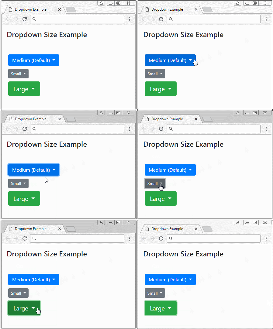
.btn-sm .btn-lg
<!-- Small Button .btn-sm -->
<div class="btn-group">
   <button class="btn btn-sm btn-secondary dropdown-toggle"
      type="button"
      id="dropdownMenuButton" data-toggle="dropdown"
      aria-haspopup="true" aria-expanded="false">
   Small
   </button>
   <div class="dropdown-menu">
      <a class="dropdown-item" href="#">Javascript</a>
      <a class="dropdown-item" href="#">Css</a>
      <div class="dropdown-divider"></div>
      <a class="dropdown-item" href="#">Bootstrap</a>
   </div>
</div>
5. Menu Header
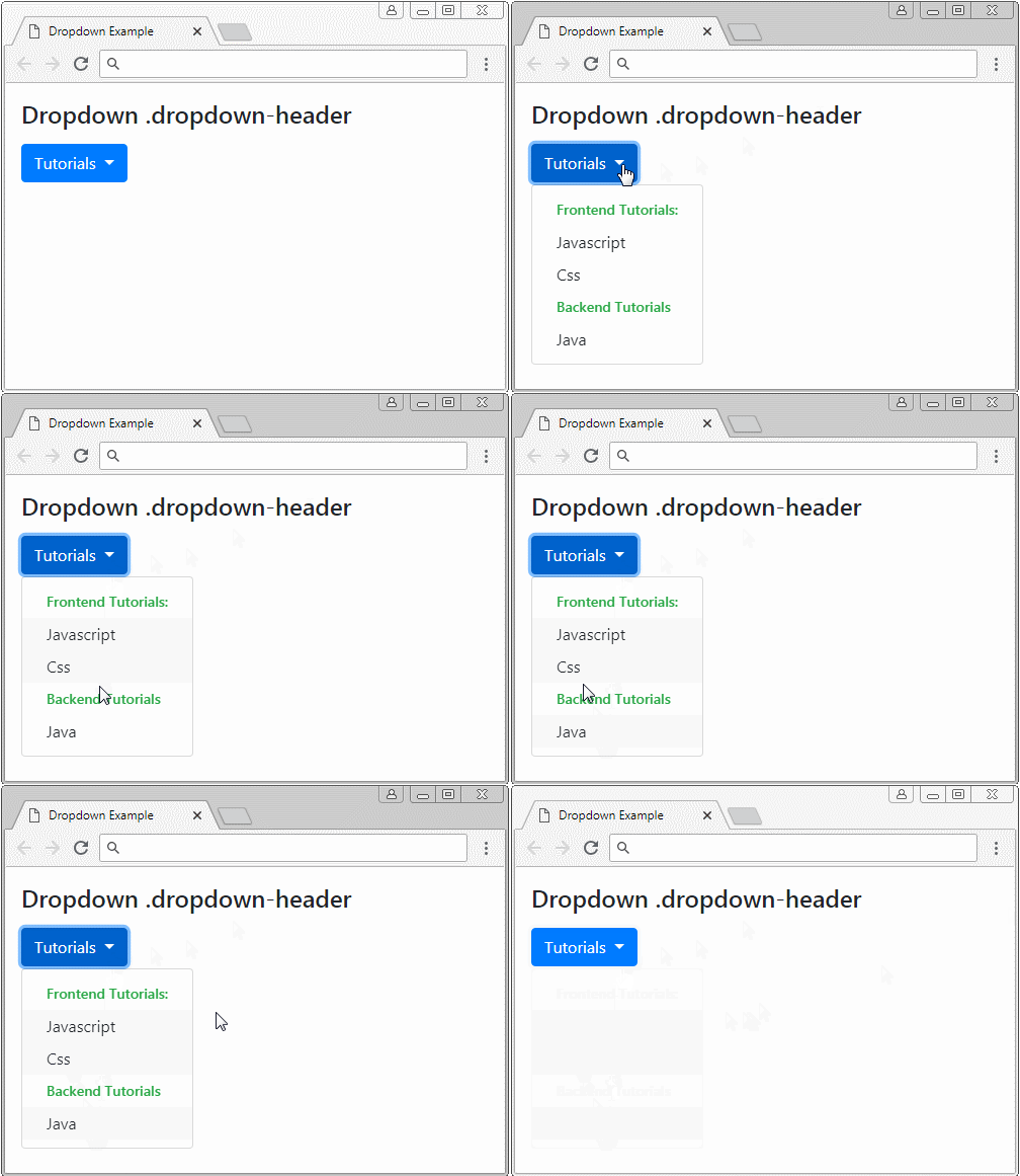
.dropdown-header
<div class="btn-group">
   <button class="btn btn-primary dropdown-toggle"
      type="button"
      id="dropdownMenuButton" data-toggle="dropdown">
   Tutorials
   </button>
   <div class="dropdown-menu">
      <h5 class="dropdown-header text-success">Frontend Tutorials:</h5>
      <a class="dropdown-item" href="#">Javascript</a>
      <a class="dropdown-item" href="#">Css</a>
      <h5 class="dropdown-header text-success">Backend Tutorials</h5>
      <a class="dropdown-item" href="#">Java</a>
   </div>
</div>
6. Menu Forms
You can put Form into ".dropdown-menu" like the following example:
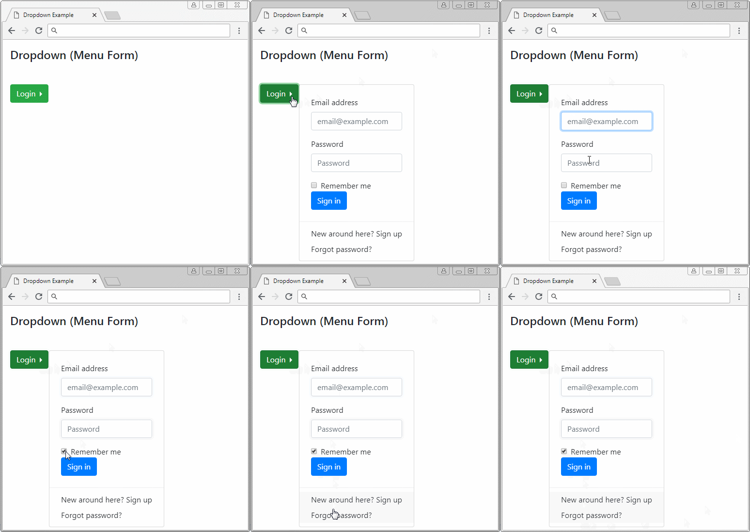
Menu Form
<div class="btn-group dropright">
   <button class="btn btn-primary dropdown-toggle"
      type="button"
      id="dropdownMenuButton" data-toggle="dropdown">
   Login
   </button>
   <div class="dropdown-menu">
      <form class="px-4 py-3">
         <div class="form-group">
            <label for="exampleDropdownFormEmail1">Email address</label>
            <input type="email" class="form-control"
               id="exampleDropdownFormEmail1" placeholder="email@example.com">
         </div>
         <div class="form-group">
            <label for="exampleDropdownFormPassword1">Password</label>
            <input type="password" class="form-control"
               id="exampleDropdownFormPassword1" placeholder="Password">
         </div>
         <div class="form-check">
            <input type="checkbox" class="form-check-input" id="dropdownCheck">
            <label class="form-check-label" for="dropdownCheck">
            Remember me
            </label>
         </div>
         <button type="submit" class="btn btn-primary">Sign in</button>
      </form>
      <div class="dropdown-divider"></div>
      <a class="dropdown-item" href="#">New around here? Sign up</a>
      <a class="dropdown-item" href="#">Forgot password?</a>
   </div>
</div>
No ADS
Bootstrap Tutorials
- Bootstrap Jumbotron Tutorial with Examples
- Bootstrap Dropdowns Tutorial with Examples
- Bootstrap Alerts Tutorial with Examples
- Bootstrap Buttons Tutorial with Examples
- Bootstrap Button Group Tutorial with Examples
- Bootstrap Popovers (Tooltips) Tutorial with Examples
- Bootstrap Spinners Tutorial with Examples
- Introduction to Bootstrap
- Bootstrap Grid System Tutorial with Examples
- Bootstrap Cards Tutorial with Examples
- Bootstrap Containers Tutorial with Examples
- Bootstrap Nav Tab/Pill Tutorial with Examples
- Bootstrap NavBars Tutorial with Examples
- Bootstrap Tables Tutorial with Examples
- Bootstrap Modal Tutorial with Examples
- Bootstrap Forms Tutorial with Examples
- Bootstrap Pagination Tutorial with Examples
- Bootstrap Badges Tutorial with Examples
- Bootstrap Input Group Tutorial with Examples
- Bootstrap List Groups Tutorial with Examples
- Bootstrap ProgressBars Tutorial with Examples
- Bootstrap Collapse and Accordion Tutorial with Examples
- Bootstrap Scrollspy Tutorial with Examples
- Bootstrap Breadcrumb Tutorial with Examples
- Bootstrap Carousel Tutorial with Examples
- Bootstrap Spacing Utilities Tutorial with Examples
- Bootstrap Border Utilities Tutorial with Examples
- Bootstrap Color Utilities Tutorial with Examples
- Bootstrap Text Utilities Tutorial with Examples
- Bootstrap Sizing Utilities Tutorial with Examples
- Bootstrap Position Utilities Tutorial with Examples
- Bootstrap Flex Utilities Tutorial with Examples
- Bootstrap Display Utilities Tutorial with Examples
- Bootstrap Visibility Utilities Tutorial with Examples
- Bootstrap Embed Utilities Tutorial with Examples
Show More