CSS Position Tutorial with Examples
1. CSS Position
CSS Position is used to set up "how an element is positioned on a document". There are 5 different methods for positioning an element on a document:
- {position: static} (Default)
- {position: relative}
- {position: fixed}
- {position: absolute}
- {position: sticky}
Only after an element is positioned by one of the above five ways the properties: top, right, bottom, right are used.
2. CSS {position: static}
Elements in HTML are positioned static, by default, which means that their position is determined by the normal rules of document. It is not affected by the Css properties: left, right, top, bottom if you intentionally set them up for it.
position-static-example.html
<div style="position:static; border:1px solid; padding:5px;">
  This div element has {position: static};
</div>
<br>
<h3>CSS {position:static; left: 50px;}</h3>
<div style="position:static; left: 50px;">
  This div element has {position: static} and {left: 50px}
</div>
3. CSS {position: relative}
No ADS
An element is positioned by the CSS {postion: relative}, which means it is positioned relative to its static position. Or in other words, you can use the CSS property (left, right, top, bottom) to adjust (move) the left, right, top, bottom position compared to its normal position.
position-relative-example.html
<h3>{position: relative;}</h3>
<div style="position: relative; width:250px;">
   position: relative; width:250px;
</div>
<br>
<h3>{position: relative; left:50px; top:50px;}</h3>
<div style="position: relative; left:50px; top:50px; width:250px;">
  position: relative; width:250px; <br/>
  left:50px; top:50px;
</div>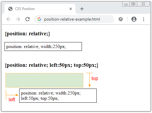
An illustration of an element having {position:relative} moved relative to its static position due to the effect of the CSS property: {left, top, bottom, right}.
Note: For an element positioned relative, the CSS properties: {top, right, bottom, left} will shift the element position from its static position (natural position), but do not change the size of the element. CSS left is given priority over CSS right. And top CSS is given priority over bottom CSS.
position-relative-example2.html
<h3>{position: relative;}</h3>
<div style="position: relative;">
   position: relative;
</div>
<br>
<h3>{position: relative; left: 50px; right: 50px;}</h3>
<div style="position: relative; left: 50px; right: 50px;">
  position: relative; <br/>
  left: 50px; right: 50px;
</div>
4. CSS {position: fixed}
No ADS
An element is positioned by the CSS {position:fixed}, which means that it will bepositioned relative to the Viewport of browser.
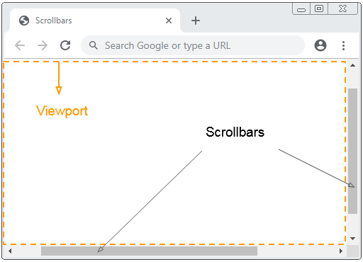
For example, use the CSS {position:fixed} to fix the position of an element to the bottom and right of Viewport:
position-fixed-example.html
<!DOCTYPE html>
<html>
   <head>
      <meta charset="utf-8"/>
      <title>CSS Position</title>
      <style>
         div {
           background-color:yellow;
           padding: 5px;
         }
      </style>
   </head>
   <body>
       <h2>{position: fixed}</h2>
       <div style="position:fixed; bottom:20px; right:15px;">
           position:fixed; bottom:20px; right:15px;
       </div>
      <p>Content .. 1</p>
      <p>Content .. 2</p>
      <p>Content .. 3</p>
      <p>Content .. 4</p>
      <p>Content .. 5</p>
   </body>
</html>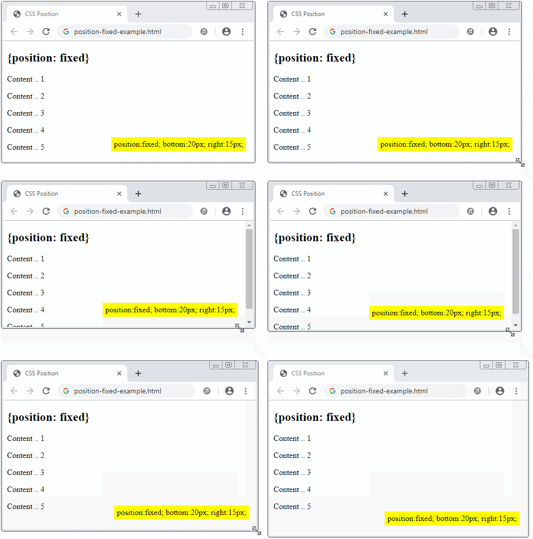
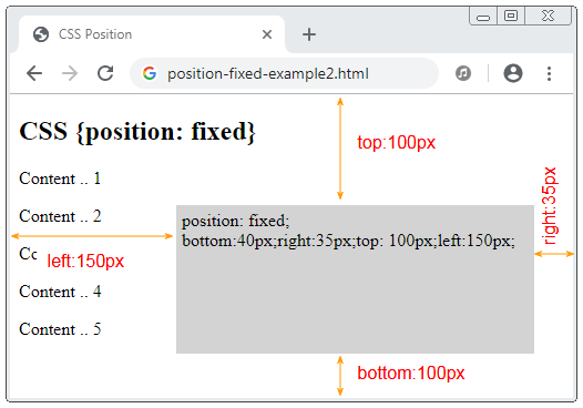
A special feature of the element with CSS {position: fixed} is that you can anchor its 4 sides to the 4 sides of the browser Viewport. In that case, if the size of the Viewport changes, the size of this element will also change. It is similar to the following illustration:
position-fixed-example2.html
<!DOCTYPE html>
<html>
   <head>
      <meta charset="utf-8">
      <title>CSS Position</title>
      <style>
         div {
           background-color: LightGray;
           padding: 5px;
         }
      </style>
   </head>
   <body>
       <h2>CSS {position: fixed}</h2>
       <div style="position: fixed; bottom:40px;right:35px;top: 100px;left:150px;">
           position: fixed; <br>
           bottom:40px;right:35px;top: 100px;left:150px;
       </div>
      <p>Content .. 1</p>
      <p>Content .. 2</p>
      <p>Content .. 3</p>
      <p>Content .. 4</p>
      <p>Content .. 5</p>
   </body>
</html>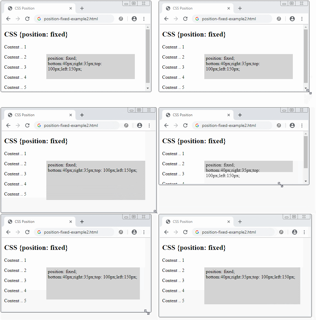
5. CSS {position: absolute}
No ADS
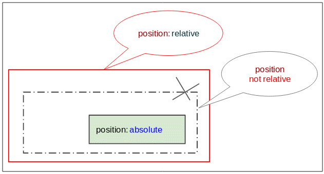
The element positioned absolute will search for its nearest ancestor (father, grandfather, ..) element that has the CSS {position: relative}. After finding, it will set up the position relative to this element. If not found it will set up the position relative to the browser Viewport.
position-absolute-example.html
<!DOCTYPE html>
<html>
   <head>
      <meta charset="utf-8"/>
      <title>CSS Position</title>
   </head>
   <body>
     <h2 class="mb-3">CSS {position:absolute}</h2>
     <div style="position:relative; height:200px;border:1px solid red;">
         I am a div {position:relative} (red).
         <div style="border:1px solid green;">
              I am a normal div (green).
              <div style="position: absolute; bottom:10px; right:15px; background:yellow;">
                 position: absolute; bottom:10px; right:15px;
              </div>
         </div>
     </div>
   </body>
</html>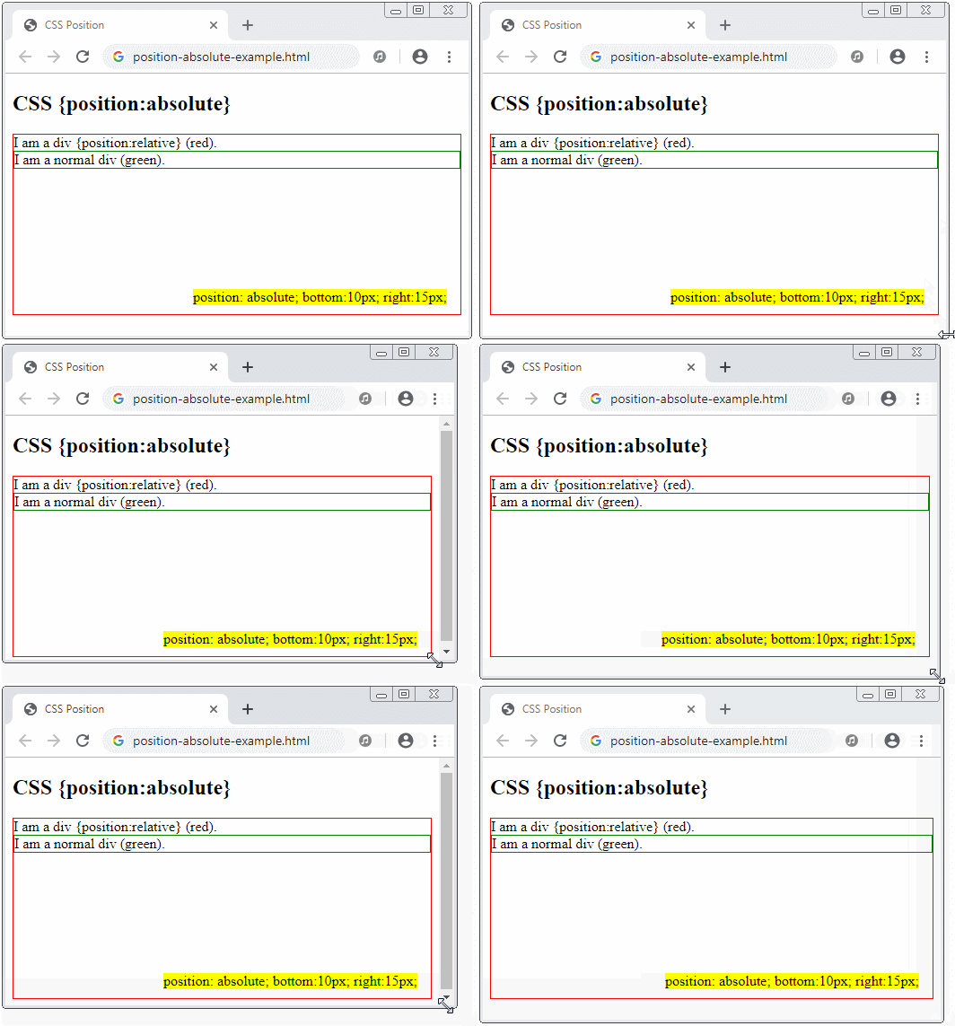
position-absolute-example2.html
<!DOCTYPE html>
<html>
   <head>
      <meta charset="utf-8"/>
      <title>Bootstrap Position</title>
   </head>
   <body>
       <h2>CSS {position:absolute}</h2>
       <div style="position:relative; height:240px;border:1px solid red;">
          I am a div {position:relative} (red).
          <div style="position:absolute;bottom:40px;right:35px;top:100px;left:150px;background:yellow;">
             position: absolute; <br/>
             bottom:40px; right:35px; <br/>
             top:100px; left:150px; <br/>
             background:yellow;
          </div>
       </div>
   </body>
</html>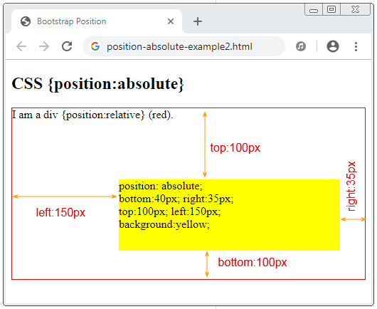
6. CSS {position: sticky}
No ADS
An element is positioned with CSS {position: sticky}, its position will be based on the user's scoll position.
An element with CSS {position:sticky} will be changed from "relative" to "fixed" or vice versa depending on the user's scroll position.
Note: IE/Edge browser, version 15 or earlier does not support the CSS {position: sticky}.
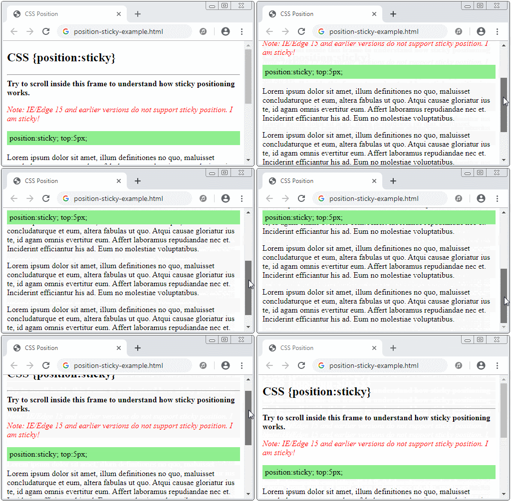
position-sticky-example.html
<!DOCTYPE html>
<html>
   <head>
      <meta charset="utf-8"/>
      <title>CSS Position</title>
   </head>
   <body>
       <h2 class="mb-3">CSS {position:sticky}</h2>
       <hr>
       <b>Try to scroll inside this frame to understand how sticky positioning works.</b>
       <p style="color: red; font-style: italic;">
          Note: IE/Edge 15 and earlier versions do not support sticky position.
          I am sticky!
       </p>
       <div style="position:sticky; top:5px; padding:5px; background: lightgreen;">
          position:sticky; top:5px;
       </div>
       <p>
          Lorem ipsum dolor sit amet, illum definitiones no quo, maluisset concludaturque et eum,
          altera fabulas ut quo. Atqui causae gloriatur ius te, id agam omnis evertitur eum.
          Affert laboramus repudiandae nec et. Inciderint efficiantur his ad. Eum no molestiae voluptatibus.
       </p>
       <p>
          Lorem ipsum dolor sit amet, illum definitiones no quo, maluisset concludaturque et eum,
          altera fabulas ut quo. Atqui causae gloriatur ius te, id agam omnis evertitur eum.
          Affert laboramus repudiandae nec et. Inciderint efficiantur his ad. Eum no molestiae voluptatibus.
       </p>
       <p>
          Lorem ipsum dolor sit amet, illum definitiones no quo, maluisset concludaturque et eum,
          altera fabulas ut quo. Atqui causae gloriatur ius te, id agam omnis evertitur eum.
          Affert laboramus repudiandae nec et. Inciderint efficiantur his ad. Eum no molestiae voluptatibus.
       </p>
   </body>
</html>
No ADS
CSS Tutorials
- Units in CSS
- Basic CSS Selectors Tutorial with Examples
- CSS Attribute Selector Tutorial with Examples
- CSS combinator Selectors Tutorial with Examples
- CSS Backgrounds Tutorial with Examples
- CSS Opacity Tutorial with Examples
- CSS Padding Tutorial with Examples
- CSS Margins Tutorial with Examples
- CSS Borders Tutorial with Examples
- CSS Outline Tutorial with Examples
- CSS box-sizing Tutorial with Examples
- CSS max-width and min-width Tutorial with Examples
- The keywords min-content, max-content, fit-content, stretch in CSS
- CSS Links Tutorial with Examples
- CSS Fonts Tutorial with Examples
- Understanding Generic Font Family Names in CSS
- CSS @font-face Tutorial with Examples
- CSS Align Tutorial with Examples
- CSS Cursors Tutorial with Examples
- CSS Overflow Tutorial with Examples
- CSS Lists Tutorial with Examples
- CSS Tables Tutorial with Examples
- CSS visibility Tutorial with Examples
- CSS Display Tutorial with Examples
- CSS Grid Layout Tutorial with Examples
- CSS Float and Clear Tutorial with Examples
- CSS Position Tutorial with Examples
- CSS line-height Tutorial with Examples
- CSS text-align Tutorial with Examples
- CSS text-decoration Tutorial with Examples
Show More