The keywords min-content, max-content, fit-content, stretch in CSS
1. Overview
In CSS there are several keywords which represent values of the size (width or height) of the element. In this article I'm going to be explaining how they work.
- min-content
- max-content
- fit-content
- stretch
Example
width: max-content;
width: min-content;
width: fit-content;
width: stretch;

max-width: max-content;
max-width: min-content;
max-width: fit-content;
max-width: stretch;

min-width: max-content;
min-width: min-content;
min-width: fit-content;
min-width: stretch;

height: max-content;
height: min-content;
height: fit-content;
height: stretch;

......
Note: The above keywords only work with block elements or inline-block elements, which ensures that the elements will display as a rectangle. (with its width and height).
2. min-content
No ADS
In a horizontal direction, the min-content keyword represents the minimum value of the width without overflowing the contents of the element horizontally.
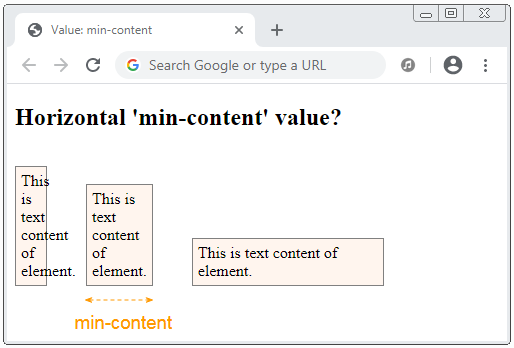
min-content-h-example.html
<!DOCTYPE html>
<html>
   <head>
      <title>Value: min-content</title>
      <meta charset="UTF-8"/>
      <style>
         .my-element  {
            display: inline-block;
            border: 1px solid gray;
            background-color: SeaShell;
            padding: 5px;
            margin: 15px 35px 0px 0px;
         }
      </style>
   </head>
   <body>
      <h2>Horizontal 'min-content' value?</h2>
       <div class="my-element" style="width:20px;">
           This is text content of element.
       </div>
       <div class="my-element" style="width: min-content;">
           This is text content of element.
       </div>
       <div class="my-element" style="width: 180px;">
           This is text content of element.
       </div>
   </body>
</html>
In a vertical direction, the min-content keyword represents the minimum value of the height without overflowing the contents of the element vertically.
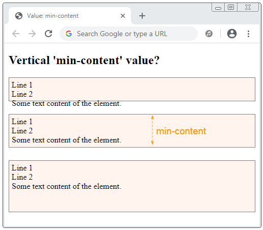
min-content-v-example.html
<!DOCTYPE html>
<html>
   <head>
      <title>Value: min-content</title>
      <meta charset="UTF-8"/>
      <style>
         .my-element  {
            border: 1px solid gray;
            padding: 5px;
            margin-bottom: 25px;
            background-color: SeaShell;
         }
      </style>
   </head>
   <body>
      <h2>Vertical 'min-content' value?</h2>
       <div class="my-element" style="height:35px;">
           Line 1 <br/>
           Line 2 <br/>
           Some text content of the element.
       </div>
       <div class="my-element" style="height: min-content;">
           Line 1 <br/>
           Line 2 <br/>
           Some text content of the element.
       </div>
       <div class="my-element" style="height: 90px;">
           Line 1 <br/>
           Line 2 <br/>
           Some text content of the element.
       </div>
   </body>
</html>
3. max-content
No ADS
max-content is a keyword that represents a value, the preferred intrinsic width of an element, or the preferred intrinsic height of an element.
How is the horizontal max-content value calculated?
width: max-content;
min-width: max-content;
max-width: max-content;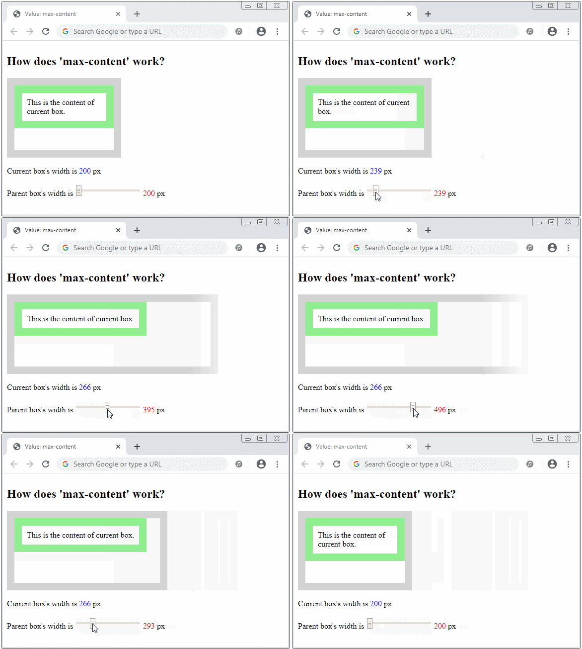
Suppose that you make the parent element infinite width (or very large), and the current element is in the minimum height (without overflowing its contents vertically). Then the max-content value is definitely the minimum width without overflowing its contents horizontally.
How is the vertical max-content value calculated?
height: max-content;
min-height: max-content;
max-height: max-content;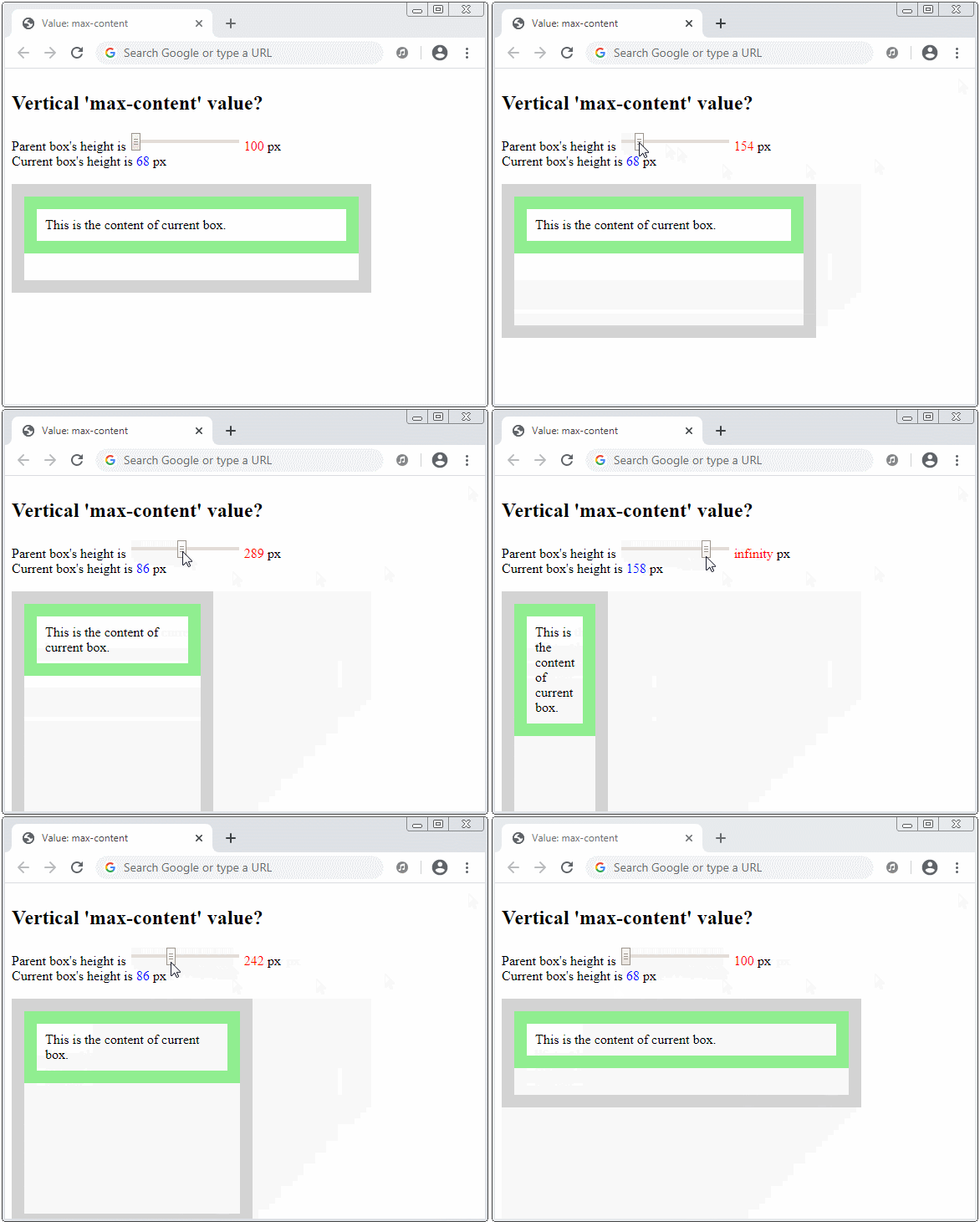
Suppose that you make the parent element infinite height (or very large), and the current element is in the minimum width (without overflowing its contents horizontally). The max-content value is then the minimum height without overflowing its contents vertically.
4. fit-content
No ADS
By default the element writes its content according to: "Horizontal, Top to Bottom" - CSS {writing-mode:horizontal-tb}. In this case, the fit-content keyword only makes sense in a horizontal direction.
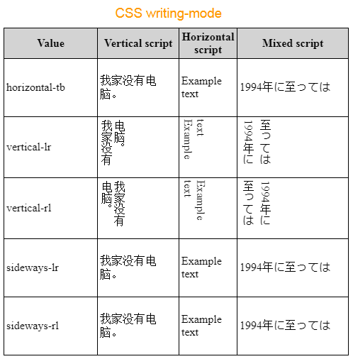
- Hướng dẫn và ví dụ CSS writing-mode
.element  {
  width: -moz-fit-content;  /** OLD Firefox */
  width: fit-content;
}
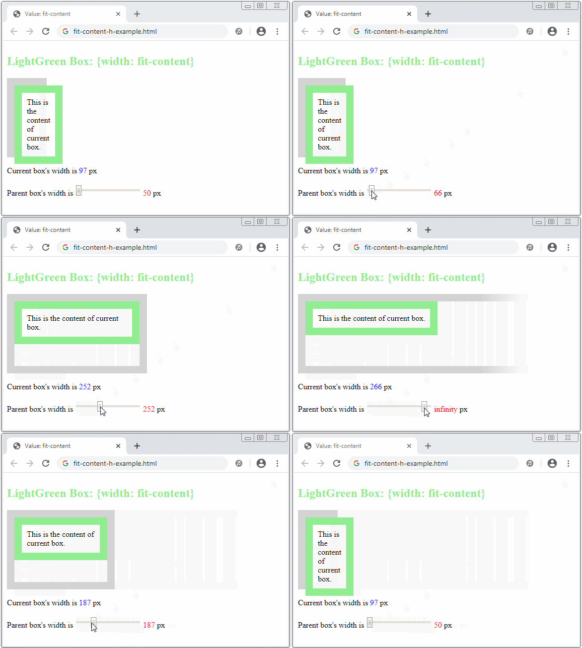
If the writing mode is horizontal, an element with CSS {width: fit-content}, which means:
- If the parent element can provide the current element with a width value greater than the max-content, then fit-content = max-content.
- If the parent element cannot provide the current element with a width value greater than the min-content, then fit-content = min-content.
- If the parent element can only provide the current element with a width value in the range (min-content, max-content), the current element will have a "fit" width to the parent element.
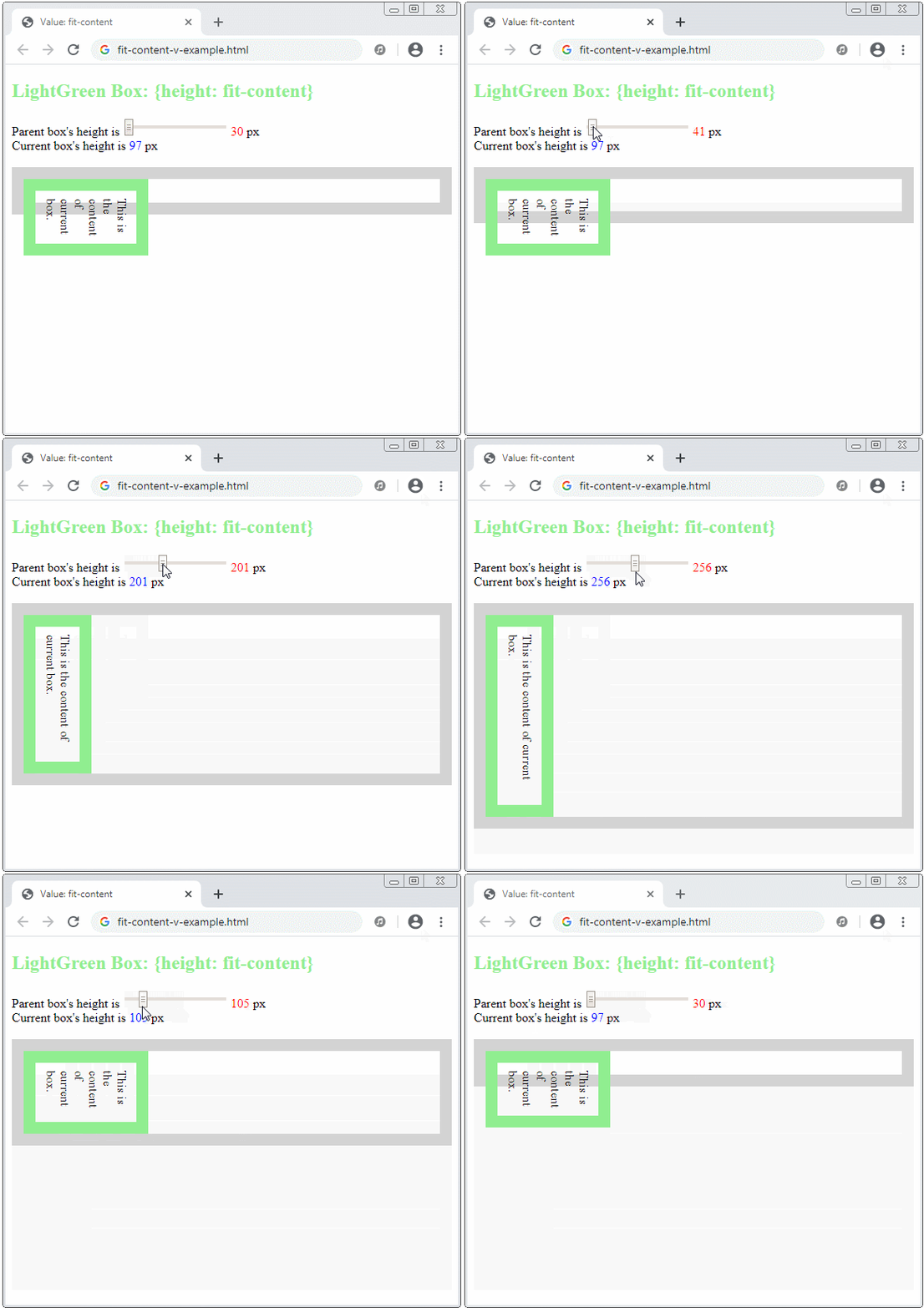
The fit-content keyword will make sense in a vertical direction if the writing mode is vertical, which means:
.element {
    writing-mode: vertical-rl | vertical-lr;
    width: fit-content;
}
No ADS
CSS Tutorials
- Units in CSS
- Basic CSS Selectors Tutorial with Examples
- CSS Attribute Selector Tutorial with Examples
- CSS combinator Selectors Tutorial with Examples
- CSS Backgrounds Tutorial with Examples
- CSS Opacity Tutorial with Examples
- CSS Padding Tutorial with Examples
- CSS Margins Tutorial with Examples
- CSS Borders Tutorial with Examples
- CSS Outline Tutorial with Examples
- CSS box-sizing Tutorial with Examples
- CSS max-width and min-width Tutorial with Examples
- The keywords min-content, max-content, fit-content, stretch in CSS
- CSS Links Tutorial with Examples
- CSS Fonts Tutorial with Examples
- Understanding Generic Font Family Names in CSS
- CSS @font-face Tutorial with Examples
- CSS Align Tutorial with Examples
- CSS Cursors Tutorial with Examples
- CSS Overflow Tutorial with Examples
- CSS Lists Tutorial with Examples
- CSS Tables Tutorial with Examples
- CSS visibility Tutorial with Examples
- CSS Display Tutorial with Examples
- CSS Grid Layout Tutorial with Examples
- CSS Float and Clear Tutorial with Examples
- CSS Position Tutorial with Examples
- CSS line-height Tutorial with Examples
- CSS text-align Tutorial with Examples
- CSS text-decoration Tutorial with Examples
Show More