Flutter SizedBox Tutorial with Examples
1. SizedBox
Unlike Container, SizedBox is a transparent box, which you cannot set the style for it (for example, background color, margin, padding, etc.). If you specify a particular size for the SizedBox, that size will also apply to its child widget. Otherwise, if the width of SizedBox is not specified or null then its child widget will have width by its own setting or equal to 0 (if not set). With height also has similar behavior.
All parameters such as width, height, size and child involved in creating a SizedBox are optional.
SizedBox constructors:
SizedBox constructor
const SizedBox(
    {Key key,
    double width,
    double height,
    Widget child}
)
SizedBox.fromSize constructor
SizedBox.fromSize(
    {Key key,
    Widget child,
    Size size}
)
SizedBox.expand constructor
const SizedBox.expand(
    {Key key,
    Widget child}
)
SizedBox.shrink constructor
const SizedBox.shrink(
    {Key key,
    Widget child}
)
If you specify a specific size to the SizedBox by the parameters of width, height, or size, this size will also apply to its child widget.
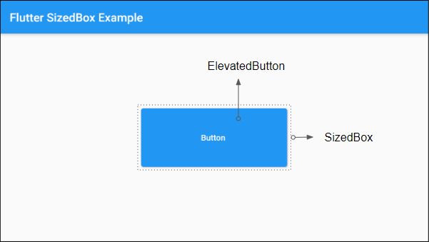
For example: Put an ElevatedButton in a 250x100SizedBox. This size will also apply to the ElevatedButton:
(ex1)
SizedBox(
    width: 250,
    height: 100,
    child: ElevatedButton(
      child: Text("Button "),
      onPressed: (){},
    )
)
You can also create the SizedBox object through the SizedBox.fromSize constructor:
SizedBox.fromSize (
    size: Size(250, 100),
    child: ElevatedButton(
      child: Text("Button"),
      onPressed: (){},
    )
)
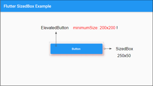
Example: An ElevatedButton is set to minimum size 200x200, but when placed in a SizedBox of a specified size (eg 250x50) it will obey the size of the SizedBox.
(ex3)
SizedBox (
    width:250,
    height: 50,
    child: ElevatedButton(
      child: Text("Button "),
      onPressed: (){},
      style: ElevatedButton.styleFrom(
          shadowColor : Colors.redAccent,
          elevation: 10,
          minimumSize: Size(200,  200 )
      )
    )
)
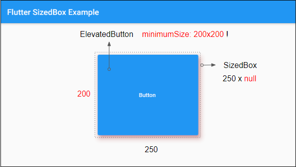
Another example: If the height of the SizedBox is not specified (or null), the height of the child widget will be determined by its own settings, or it is equal to 0 (if there is no its own settings).
(ex4)
SizedBox (
    width:250,
    child: ElevatedButton(
      child: Text("Button "),
      onPressed: (){},
      style: ElevatedButton.styleFrom(
          shadowColor : Colors.redAccent,
          elevation: 10,
          minimumSize: Size(200,  200 )
      )
    )
)
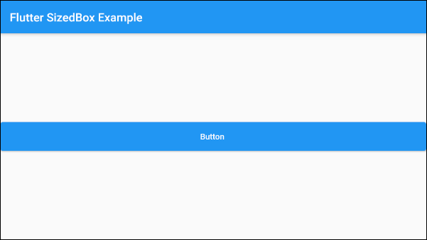
For example: setting double.infinity to the width of SizedBox, its width will be as large as possible in parent widget's permission.
(ex5)
SizedBox (
    width: double.infinity,
    height: 50,
    child: ElevatedButton(
        child: Text("Button "),
        onPressed: (){}
    )
)
2. SizedBox.fromSize
The SizedBox.fromSize constructor is used to create a SIzedBox with the specified size through an optional parameter, size.
SizedBox.fromSize Constructor
SizedBox.fromSize(
    {Key key,
    Widget child,
    Size size}
)
For example:
SizedBox.fromSize (
    size: Size(250, 100),
    child: ElevatedButton(
      child: Text("Button "),
      onPressed: (){},
    )
)
3. SizedBox.expand
No ADS
SizedBox.expand constructor is used to create a SizedBox with the width and height of double.infinity. This means the size of the SizedBox will be as large as possible by the permission of the parent widget.
SizedBox.expand constructor
const SizedBox.expand(
    {Key key,
    Widget child}
)
4. SizedBox.shrink
SizedBox.shrink constructor is used to create a SizedBox with the smallest size as suggested from its parent widget.
SizedBox.shrink Constructor
const SizedBox.shrink(
    {Key key,
    Widget child}
)
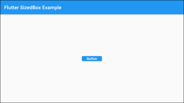
In this example, we have a SizedBox created by the SizedBox.shrink constructor, and its parent widget, a ConstrainedBox, is set to the minimum size of 80x20. The SizedBox will shrink its size to best fit the minimum size of the parent widget.
(ex6)
ConstrainedBox(
    constraints: new BoxConstraints( // Min: 80x20
        minWidth: 80.0,
        minHeight: 20.0
    ),
    child: SizedBox.shrink(
      child: ElevatedButton(
        child: Text('Button'),
        onPressed: () {},
      ),
    )
)
- Flutter ConstrainedBox
No ADS
Flutter Programming Tutorials
- Flutter Container Tutorial with Examples
- Flutter Tween Tutorial with Examples
- Flutter ElevatedButton Tutorial with Examples
- Flutter IndexedStack Tutorial with Examples
- Flutter IconButton Tutorial with Examples
- Flutter Column Tutorial with Examples
- Flutter SizedBox Tutorial with Examples
- Flutter CircleAvatar Tutorial with Examples
- Install Flutter SDK on Windows
- Flutter Positioned Tutorial with Examples
- Flutter BottomNavigationBar Tutorial with Examples
- Flutter StadiumBorder Tutorial with Examples
- Flutter ContinuousRectangleBorder Tutorial with Examples
- Flutter Spacer Tutorial with Examples
- Flutter LinearProgressIndicator Tutorial with Examples
- Flutter EdgeInsetsGeometry Tutorial with Examples
- Flutter TabBar Tutorial with Examples
- Flutter BottomAppBar Tutorial with Examples
- Flutter Center Tutorial with Examples
- Flutter Border Tutorial with Examples
- Flutter Stack Tutorial with Examples
- Flutter Navigation and Routing Tutorial with Examples
- Install Flutter Plugin for Android Studio
- Flutter SnackBar Tutorial with Examples
- Flutter Scaffold Tutorial with Examples
- Flutter CircularProgressIndicator Tutorial with Examples
- Flutter AlertDialog Tutorial with Examples
- Flutter RoundedRectangleBorder Tutorial with Examples
- Flutter SplashScreen Tutorial with Examples
- Flutter EdgeInsets Tutorial with Examples
- Flutter AppBar Tutorial with Examples
- Flutter CircleBorder Tutorial with Examples
- Flutter Expanded Tutorial with Examples
- Flutter Row Tutorial with Examples
- Flutter SimpleDialog Tutorial with Examples
- Flutter Banner Tutorial with Examples
- Create your first Flutter app - Hello Flutter
- Flutter RotatedBox Tutorial with Examples
- Flutter TextButton Tutorial with Examples
- Flutter Alignment Tutorial with Examples
- Flutter FlatButton Tutorial with Examples
- Flutter Align Tutorial with Examples
- Flutter Card Tutorial with Examples
- Flutter FancyBottomNavigation Tutorial with Examples
Show More