FlutterArtist Themes
Để tạo một Theme tùy biến, bạn cần viết một lớp mở rộng từ FaTheme và triển khai các thành phần cốt lõi. Đây là khung sườn cơ bản:
1. FaTheme
To create a custom theme, you need to extend the FaTheme class and implement its core components. Here is the basic skeleton:
CustomFaTheme
class CustomFaTheme extends FaTheme {
  @override
  String get name => "Artist Midnight";

  @override
  IconData get icon => Icons.dark_mode_outlined;

  @override
  Color get seedColor => const Color(0xFF1A237E);

  @override
  Brightness get brightness => Brightness.dark;

  @override
  String? get fontFamily => 'Inter';

  @override
  FaThemeTokens createThemeTokens() {
      // ....
  }
}
name
The unique identifier for the Theme. Avoid duplicates; if a conflict occurs, the newly registered Theme will overwrite the existing one in FaThemeHub.
icon
The visual icon representing the Theme, making it easy for users to identify and select within the selection Dialog.
fontFamily
The primary font family applied consistently across the entire system.
seedColor
The "seed" that allows FlutterArtist (via Material 3 algorithms) to automatically generate a harmonious ColorScheme. Instead of manually defining dozens of colors, the system handles the rest, ensuring standard contrast and aesthetic appeal.
brightness
brightness - is more than just swapping background colors. It acts as a "suggestion" for FlutterArtist to handle contrast. When set to Brightness.dark, the system understands that surfaces will have dark tones and automatically calculates foreground colors (onSurface, onPrimary) to lighter shades, ensuring content remains crisp and legible.
createThemeTokens()
The createThemeTokens() method is where you define the "DNA" of your UI. The beauty of this system is that you don't have to redefine everything from scratch. You can leverage the rulebook automatically generated from the seedColor and simply override specific details that don't meet your needs. These targeted changes apply only to those elements, without disrupting the overall consistency of the system.
tokens
Provides access to the design tokens you've defined via the createThemeTokens() method.
2. FaThemeTokens
If FaTheme is the master plan, then FaThemeTokens is the detailed technical specification. This class extends ThemeExtension, a powerful Flutter feature that allows us to extend the standard ThemeData without breaking the framework's core structure.
FaThemeTokens acts as a massive "container," unifying all aspects of the design language — from colors and spacing to motion effects — into a single entity. This ensures UI management remains centralized, consistent, and incredibly easy when passing theme data down the widget tree via BuildContext.
FaThemeTokens
class FaThemeTokens extends ThemeExtension<FaThemeTokens> {
  final FaColorTokens colors;
  final FaSpacingTokens spacing;
  final FaRadiusTokens radius;
  final FaElevationTokens elevation;
  final FaTypographyTokens typography;
  final FaComponentTokens components;
  final FaLayoutTokens layout;
  final FaMotionTokens motion;


  FaThemeTokens({
    required this.colors,
    required this.spacing,
    required this.radius,
    required this.elevation,
    required this.typography,
    required this.components,
    required this.layout,
    required this.motion,
  });

  // ...
} 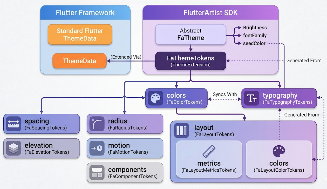
colors (FaColorTokens):
Manages the color system. Use FaColorTokens.fromSeed(seedColor) for auto-generation, then use .copyWith() to override only specific colors like primary or error.
spacing (FaSpacingTokens):
Defines standard spacing (padding, margin), ensuring a consistent whitespace "rhythm" throughout the UI.
radius (FaRadiusTokens):
Governs corner radii. Change it once, and the entire app becomes "soft" or "sharp" instantly.
elevation (FaElevationTokens):
Manages shadows and widget layering, creating a sense of spatial depth.
typography (FaTypographyTokens):
A collection of TextStyle(s) for title, body, and caption.
components (FaComponentTokens):
Specific tweaks for individual widgets like Button(s) or Card(s).
layout (FaLayoutTokens):
Defines layout parameters like Sidebar width or Max Content Width.
motion (FaMotionTokens):
Defines the duration and curves of motion effects.
3. FaColorTokens
If FaThemeTokens is the brain, then FaColorTokens is the eyes of the application. It is the central hub for all color definitions, ranging from vibrant primary hues to the subtle shades of surfaces and borders.
The key feature is that the properties in this class are fully compatible with and designed to override standard Flutter Theme properties. We preserve the original meaning and intent of each color to keep things familiar, while providing much more powerful customization capabilities.
FaColorTokens
class FaColorTokens {
  final Brightness brightness;

  final Color? divider;
  final Color primary;
  final Color onPrimary;
  final Color secondary;
  final Color onSecondary;

  final Color error;
  final Color onError;

  final Color background;
  final Color surface;
  final Color onSurface;
  final Color onSurfaceVariant;

  final Color surfaceContainerLowest;
  final Color surfaceContainerLow;
  final Color surfaceContainer;
  final Color surfaceContainerHigh;
  final Color surfaceContainerHighest;

  final Color textPrimary;
  final Color textSecondary;
  final Color border;
  final Color outlineVariant;
  final Color tertiary;
  final Color onTertiary;
  final Color outline;
  final Color shadow;
  final Color scrim;
  final Color inverseSurface;
  final Color onInverseSurface;
  final Color inversePrimary;

  const FaColorTokens({
    required this.brightness,
    required this.primary,
    required this.onPrimary,
    // ...
  });

  factory FaColorTokens.fromSeed(Color seed) {
    final scheme = ColorScheme.fromSeed(seedColor: seed);

    return FaColorTokens(
      brightness: scheme.brightness,
      primary: scheme.primary,
      onPrimary: scheme.onPrimary,
      // ...
    );
  }
}
Understanding primary & onPrimary
To help you get started, let's look at the two "main characters" that appear most frequently:
primary:
The main brand color. It is used for key components like primary action buttons, selected states, or prominent toolbars.
onPrimary:
The color for content (text or icons) displayed on top of the primary color. For example, if your button is blue (primary), the text inside should be white (onPrimary) to ensure perfect contrast.
Don't Worry!
The great thing is, no matter how much you customize within FaColorTokens, you can still access these colors using the standard Flutter Theme.of(context) call. The FlutterArtist system ensures all your changes are perfectly synced with the standard ColorScheme.
// Standard way to access colors
final Color primaryColor = Theme.of(context).colorScheme.primary;
final Color textColorOnPrimary = Theme.of(context).colorScheme.onPrimary;

// Everything works perfectly with your custom overrides!
4. FaTypographyTokens
FaTypographyTokens acts as a powerful override filter for the typography system. The beauty of this class is its "optional" nature: you don't need to redefine all 15 Material Design styles. If you want to change a specific style, simply provide that property with a non-null value. Anything left null will be automatically filled by FlutterArtist using Material 3 default standards.
FaTypographyTokens
class FaTypographyTokens {
  // --- DISPLAY ---
  final TextStyle? displayLarge;
  final TextStyle? displayMedium;
  final TextStyle? displaySmall;

  // --- HEADLINE ---
  final TextStyle? headlineLarge;
  final TextStyle? headlineMedium;
  final TextStyle? headlineSmall;

  // --- TITLE
  final TextStyle? titleLarge;
  final TextStyle? titleMedium;
  final TextStyle? titleSmall;

  // --- BODY
  final TextStyle? bodyLarge;
  final TextStyle? bodyMedium;
  final TextStyle? bodySmall;

  // --- LABEL ---
  final TextStyle? labelLarge;
  final TextStyle? labelMedium;
  final TextStyle? labelSmall;
}
Traditional Access
The great thing is that all your customizations in FaTypographyTokens are directly synced into Flutter's TextTheme via FaThemeFactory. This means you can still use the familiar Theme.of(context) call without changing your coding habits
// Standard Flutter way to access your custom styles
Text(
  "Hello FlutterArtist",
  style: Theme.of(context).textTheme.titleLarge,
);
Typography Reference Table
Below are the attribute groups you can override in FaTypographyTokens:
display(Large/Medium/Small) | Ultra-large text or numbers, used to create a strong visual impact on the screen. |
headline(Large/Medium/Small) | Main titles for pages or critical content sections. |
title(Large/Medium/Small) | Titles for Widgets, Dialogs, or list items. |
body(Large/Medium/Small) | The core of the content, used for all detailed informational text. |
label(Large/Medium/Small) | Labels for buttons, captions, or input field labels. |
In Flutter, although there are up to 15 predefined text styles (TextStyle), in practice only a few are used most frequently.
titleMedium:
Commonly used for Card titles, Dialog headers, or list items. It’s not as large as a headline, but still prominent enough for users to recognize it as a title.
bodyMedium:
Suitable for descriptions, article content, or user data. It is optimized for long reading sessions without causing eye strain.
labelLarge:
Typically used for buttons or short labels that need clarity. It often has a stronger font weight to draw attention to actions.
5. FaButtonTokens
While colors and typography create the look, FaButtonTokens defines the feel and consistency of buttons across the entire system. Instead of having inconsistent styles, you can set a common "standard" for height and border radius for all buttons in your app.
FaButtonTokens
class FaButtonTokens {
  final double height;
  final double radius;

  const FaButtonTokens({this.height = 40, this.radius = 8});
}
A crucial point to note: Unlike FaColorTokens or FaTypographyTokens, which are mapped to ThemeData to override default Flutter values, FaButtonTokens is a completely independent Extension.
This means you cannot access these parameters via the traditional Theme.of(context). Instead, you will use FlutterArtist's "specialty": context.faTokens.
Why do we do this? Because we want to keep Flutter's ThemeData as clean as possible, while providing you with a shorter, more intuitive path to fetch custom parameters that are not available in standard Flutter.
ElevatedButton
// The FlutterArtist way
ElevatedButton(
  style: ElevatedButton.styleFrom(
    minimumSize: Size(0, context.faTokens.components.button.height),
    shape: RoundedRectangleBorder(
      borderRadius: BorderRadius.circular(context.faTokens.components.button.radius),
    ),
  ),
  onPressed: () {},
  child: const Text("Click Me"),
)
6. FaCardTokens
While Buttons emphasize actions, Card is the "home" for content. FaCardTokens defines how information blocks are wrapped and presented. Instead of manually calculating padding or border radius for every frame, you simply set a common standard to create a visual rhythm across your entire UI.
FaCardTokens
class FaCardTokens {
  final double radius;
  final double padding;

  const FaCardTokens({this.radius = 12, this.padding = 16});
}
Similar to its sibling FaButtonTokens, FaCardTokens is also an independent Extension. It doesn't blindly override Flutter's default CardTheme.
// Implementing a perfectly standardized Card
Container(
  padding: EdgeInsets.all(context.faTokens.components.card.padding),
  decoration: BoxDecoration(
    color: context.faTokens.colors.surface,
    borderRadius: BorderRadius.circular(context.faTokens.components.card.radius),
    boxShadow: context.faTokens.shortcut.cardShadows,
  ),
  child: const Text("Artist Content"),
)
7. FaComponentTokens
FaComponentTokens is an aggregate class used to manage design tokens at the component level within a UI system.
FaComponentTokens
class FaComponentTokens {
  final FaButtonTokens button;
  final FaCardTokens card;

  const FaComponentTokens({
    this.button = const FaButtonTokens(),
    this.card = const FaCardTokens(),
  });
}
The structure of FaComponentTokens includes sub-token groups such as FaButtonTokens and FaCardTokens, each representing the visual configuration of a specific component type.
8. FaLayoutTokens
FaLayoutTokens defines all design tokens related to layout within the UI system.
This class is designed to group layout-related values into two main parts: metrics and colors, ensuring a clear separation between structural layout and visual styling.
FaLayoutTokens
class FaLayoutTokens {
  final FaLayoutMetricsTokens metrics;
  final FaLayoutColorTokens colors;

  const FaLayoutTokens({
    this.metrics = const FaLayoutMetricsTokens(),
    required this.colors,
  });
}
9. FaLayoutColorTokens
FaLayoutColorTokens defines color tokens specifically for layout regions such as sidebar and topbar.
FaLayoutColorTokens
class FaLayoutColorTokens {
  final Color sidebarSurface;
  final Color onSidebarSurface;

  final Color topbarSurface;
  final Color onTopbarSurface;

  const FaLayoutColorTokens({
    required this.sidebarSurface,
    required this.onSidebarSurface,
    required this.topbarSurface,
    required this.onTopbarSurface,
  });

  factory FaLayoutColorTokens.fromColorTokens(FaColorTokens colors) {
    return FaLayoutColorTokens(
      sidebarSurface: colors.surfaceContainerLow,
      onSidebarSurface: colors.onSurface,
      topbarSurface: colors.surface,
      onTopbarSurface: colors.onSurface,
    );
  }
}
Unlike a global color palette, this class is semantic, mapping colors to specific UI regions to ensure design consistency.
// Applying to a custom Sidebar
Container(
  color: context.faTokens.layout.colors.sidebarSurface,
  child: Icon(
    Icons.menu,
    color: context.faTokens.layout.colors.onSidebarSurface,
  ),
)
sidebarSurface | Background color of the sidebar. Usually uses a darker or contrasting tone to create depth. |
onSidebarSurface | Color for text and icons on the Sidebar, ensuring they are always legible. |
topbarSurface | Background color for the top toolbar. FlutterArtist uses this to configure the AppBarTheme. |
onTopbarSurface | The color for titles and action buttons on the Topbar. |
10. FaLayoutMetricsTokens
FaLayoutMetricsTokens defines dimensional and constraint-related layout values. These values directly affect how layout is arranged on the screen.
// Setting Sidebar width dynamically from Tokens
SizedBox(
  width: context.faTokens.layout.metrics.sidebarWidth,
  child: const AppSidebar(),
)
// Applying max width for web layouts
ConstrainedBox(
  constraints: BoxConstraints(
    maxWidth: context.faTokens.layout.metrics.contentMaxWidth ?? double.infinity,
  ),
  child: const MainFeed(),
)
sidebarWidth | Governs the width of the side navigation bar. Ensures the Sidebar maintains a precise size across all screens. |
contentMaxWidth | Limits the width of the primary content (typically for large screens). Prevents overly long lines of text that hinder readability. |
11. FaMotionTokens
A static interface often feels rigid. FaMotionTokens exists to manage animations, defining the speed and rhythm of visual feedback. Instead of using random numbers for durations or scattered animation curves, this class helps you organize them into a single standard.
FaMotionTokens
class FaMotionTokens {
  final Duration fast;
  final Duration normal;
  final Duration slow;

  final Curve standard;
  final Curve emphasized;

  const FaMotionTokens({
    this.fast = const Duration(milliseconds: 120),
    this.normal = const Duration(milliseconds: 220),
    this.slow = const Duration(milliseconds: 360),
    this.standard = Curves.easeOut,
    this.emphasized = Curves.easeInOut,
  });
}
Please note that FaMotionTokens is a completely supplementary Extension. In standard Flutter, there is no specific place within ThemeData to centrally store shared Duration(s) or Curve(s) for the entire app.
// Implementing a smooth animated container
AnimatedContainer(
  duration: context.faTokens.motion.normal,
  curve: context.faTokens.motion.standard,
  color: isSelected
      ? Theme.of(context).colorScheme.primary
      : Theme.of(context).colorScheme.surface,
  child: const MyWidget(),
)
No ADS
FlutterArtist
- Basic concepts in Flutter Artist
- FlutterArtist Block ex1
- FlutterArtist Filter Example
- FlutterArtist FilterModel MultiOptFilterCriterion ex1
- FlutterArtist FilterInput Example 1
- FlutterArtist Form ex1
- The idea of designing filter models in FlutterArtist
- FlutterArtist FormModel.patchFormFields() Ex1
- FlutterArtist BlockQuickItemUpdateAction Example
- FlutterArtist BlockNumberPagination Ex1
- FlutterArtist GridView Infinite Scroll Example
- FlutterArtist BlockQuickMultiItemCreationAction Example
- FlutterArtist ListView Infinite Scroll Pagination Example
- FlutterArtist Pagination
- FlutterArtist Sort DropdownSortPanel Example
- FlutterArtist Dio
- FlutterArtist BlockBackendAction Example
- FlutterArtist BackgroundWebDownloadAction Example
- FlutterArtist StorageBackendAction ex1
- FlutterArtist Block External Shelf Event Example
- FlutterArtist Filter FormBuilderMultiDropDown Ex1
- FlutterArtist Master-detail Blocks ex1
- FlutterArtist Scalar ex1
- FlutterArtist Pagination Davi table Infinite Scroll Ex1
- FlutterArtist Filter Tree FormBuilderField ex1
- FlutterArtist Filter FormBuilderRadioGroup ex1
- FlutterArtist Form Parent-child MultiOptFormProp ex1
- FlutterArtist Manual Sorting ReorderableGridView Example
- FlutterArtist Manual Sorting ReorderableListView
- FlutterArtist Scalar External Shelf Event Example
- FlutterArtist Code Flow Viewer
- FlutterArtist Log Viewer
- FlutterArtist config
- FlutterArtist StorageStructure
- FlutterArtist Debug Storage Viewer
- FlutterArtist DebugMenu
- FlutterArtist Debug UI Components Viewer
- FlutterArtist Debug Shelf Structure Viewer
- FlutterArtist Context Provider Views
- FlutterArtist FilterModelStructure ex1
- FlutterArtist FilterModelStructure ex2
- FlutterArtist FilterModelStructure ex3
- FlutterArtist Internal Shelf Event ex1
- FlutterArtist Deferring External Shelf Events Example
- FlutterArtist DropdownSortPanel
- Overview of FlutterArtist Themes
- FlutterArtist Themes
- FlutterArtist Themes FaColorUtils
Show More